
All icon-based copy block sections should maintain a balanced, consistent appearance. If the total number of blocks leaves an incomplete final row, adjust the layout so the section still looks intentional and visually even.

A 301 redirect: guiding web traffic to a new destination with a permanent, virtual "follow me" sign.


This setup provides clients with a lightweight, SEO-optimized, scalable way to showcase inventory using the blog feature. It requires design discipline, metadata precision, and clear client education to function effectively. Restores client-side flexibility after the removal of manual page creation capabilities
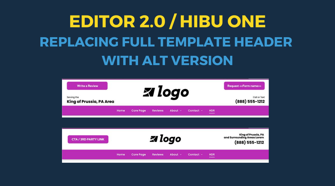
Follow these steps to replace the default template header with an alternate version
Advanced Grid - Lets you organize a section into rows and columns for better layout control. It helps create clean, balanced designs by giving you precise control over where things appear on the page.
How to Update Run-of-Site Request CTA Buttons and Headlines in Editor 2.0
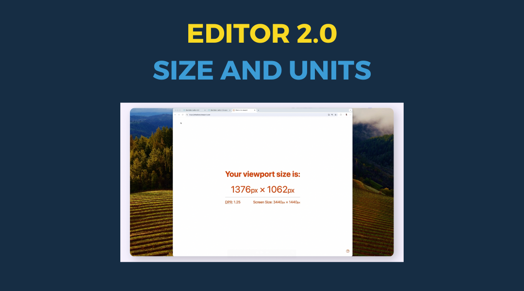
In this section, you’ll learn how to control the size of elements using different types of units in Editor 2.0. We’ll break down how viewport width (vw) and height (vh) respond to the browser window, how the auto unit allows containers to resize based on their content, and how min/max values help you keep your elements within practical size limits. Together, these tools give you greater control over how your site adapts across devices—without relying on fixed pixel values.
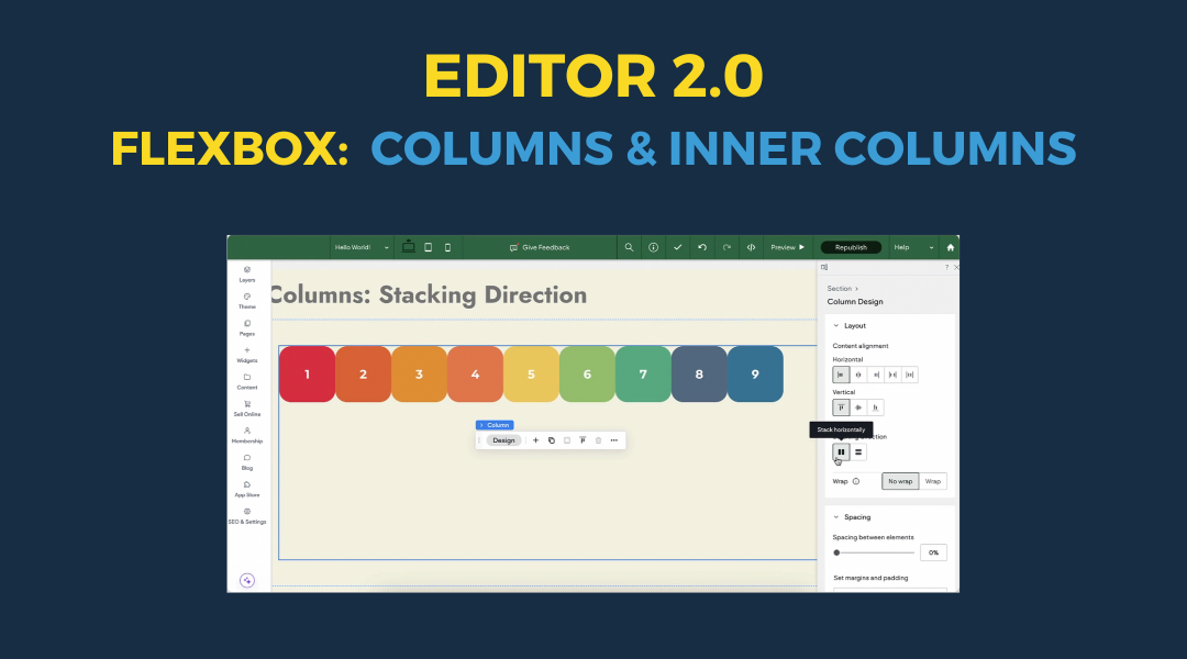
Flexbox is the foundation for how columns behave in Editor 2.0. It controls how elements stack, align, and space themselves inside containers, giving you full control over layout across different screen sizes. By adjusting properties like stacking direction, content alignment, and wrap, you can create clean, organized designs that adapt smoothly to any device. These features help prevent layout issues, make better use of space, and simplify how you manage rows and individual elements. Learning how to use Flexbox effectively leads to faster builds and more consistent, responsive websites.
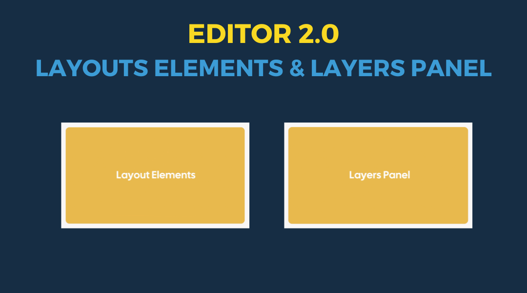
Understanding layout elements and the Layers Panel is key to building clean, responsive websites. Layout elements help you control structure—how widgets are grouped, how content stacks, and how different parts of the page respond across breakpoints. The Layers Panel gives you a clear view of that structure, making it easier to manage complex sections, find hidden elements, and keep your layout organized. Together, these tools let you build with more precision, troubleshoot faster, and maintain consistency across the entire site.
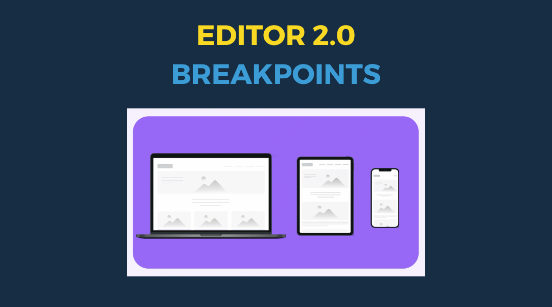
Breakpoints are specific screen widths where your website layout shifts to fit different devices, like phones, tablets, and desktops. They’re a key part of responsive design, allowing you to adjust styles so your site looks and works well on any screen. In the editor, you can see how styles behave at each breakpoint, apply universal styles, and override them when needed. You can also preview your site at different screen sizes to make sure everything looks right.
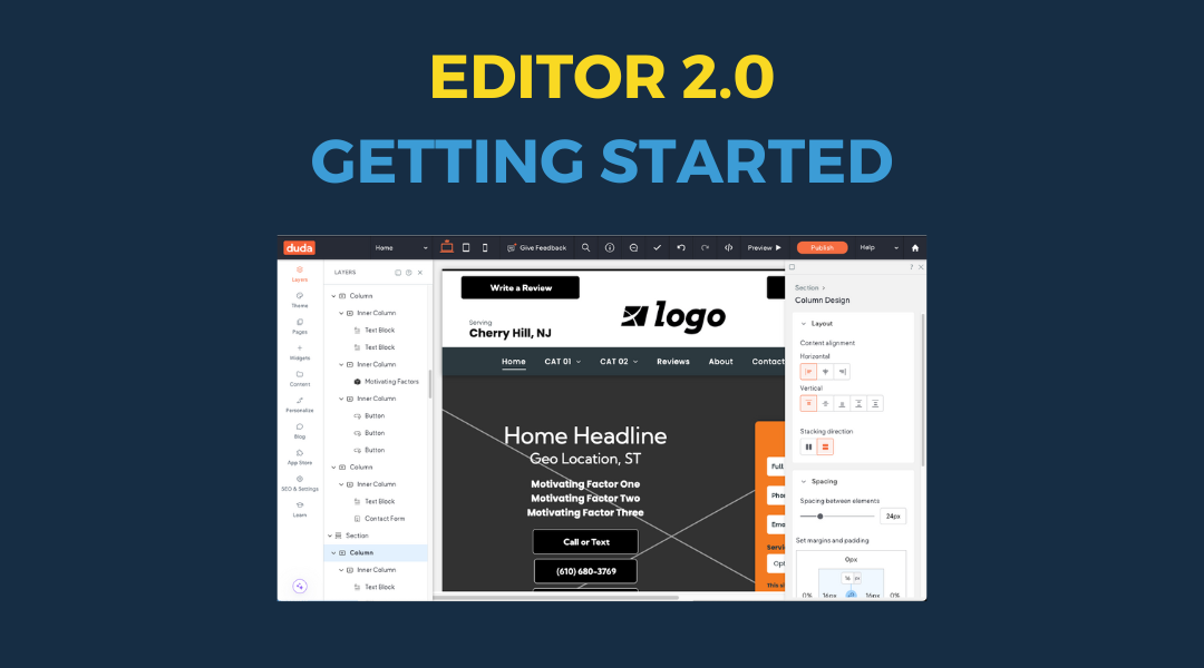
Editor 2.0 gives you powerful tools to build and manage your website with more control, flexibility, and ease. Before you dive into editing, it helps to understand how the interface is structured and what each part of the editor does.
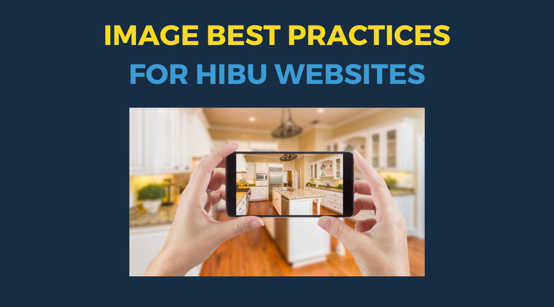
What to Know Before You Submit / Upload a Photo Images can make or break a small business website. Whether you’re a contractor, hairstylist, dentist, or restaurant owner, the photos you upload should build trust, highlight your work, and make your business look professional. Most business owners aren’t photographers. They're using iPhones or Androids, often snapping pictures during the workday. That’s fine — as long as you follow a few simple best practices. This guide covers what you need to know before you add images to your site, including: The right image sizes and formats for web What types of images help convert leads How to take better photos of your team and your work Tips for lighting, composition, naming, and consistency When to not use images at all The tips here work for any type of business — we’ve just included examples from home service contractors since they make up a large number of Hibu sites. Let’s get everything in frame.
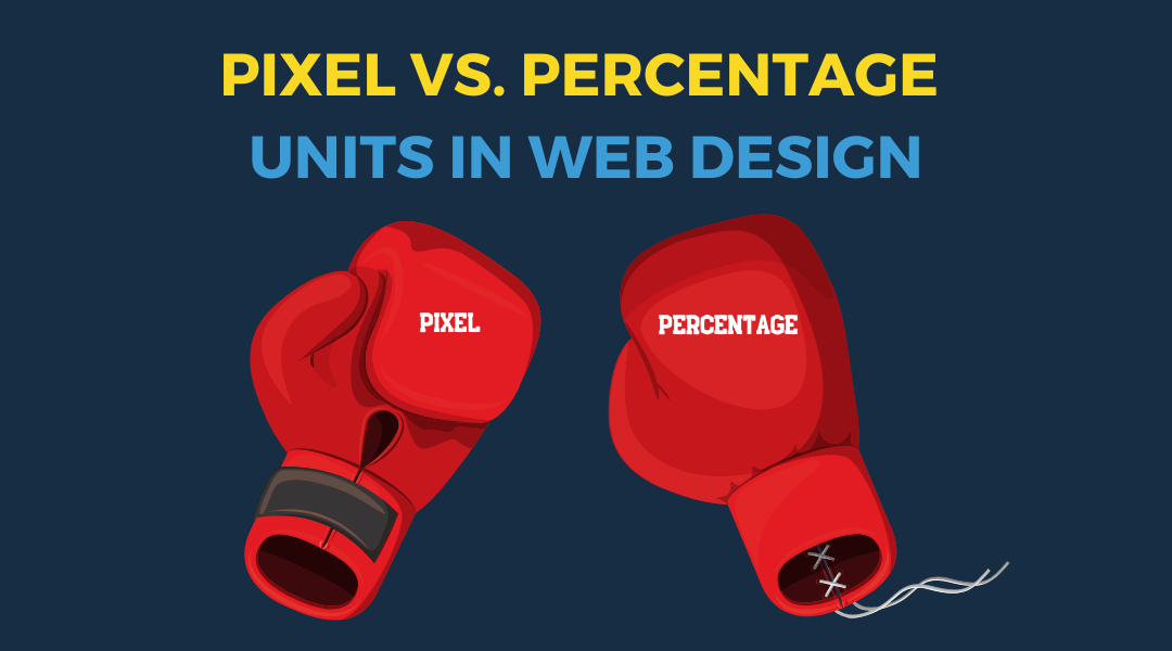
Pixel vs. Percentage Units: Why They Matter in Responsive Web Design When you're building websites that need to work across all screen sizes—from wide desktop monitors to narrow mobile phones—how you size elements matters. At Hibu, we design for everyone. That means every element must display correctly on every device. If your content is misaligned, crammed, or floating awkwardly, users won’t stick around—and they won’t convert. One of the most important layout choices you’ll make is whether to use pixel or percentage units for sizing.
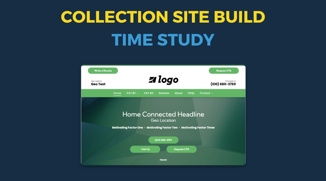
Training Overview: Initial Build Setup vs. Editor 2.0 & Collection Site We're moving from the current initial build setup to a new approach with Editor 2.0 and the Collection Site . This transition is more than just switching editors—it changes how we structure content, manage data, and ensure consistency across sites.
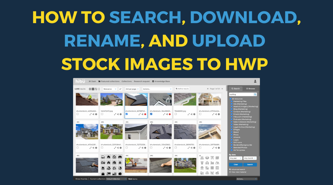
Overview For these steps, assume you are building a residential general contractor website . You need to add stock images for the hero sections of the following pages: Homepage (general home-related image) Roofing page Siding page Gutter page Additionally, the hero images from all core pages (roofing, siding, gutters) will also be displayed as the homepage copy block image . These steps will guide you through finding, downloading, renaming, and uploading stock images to the website.
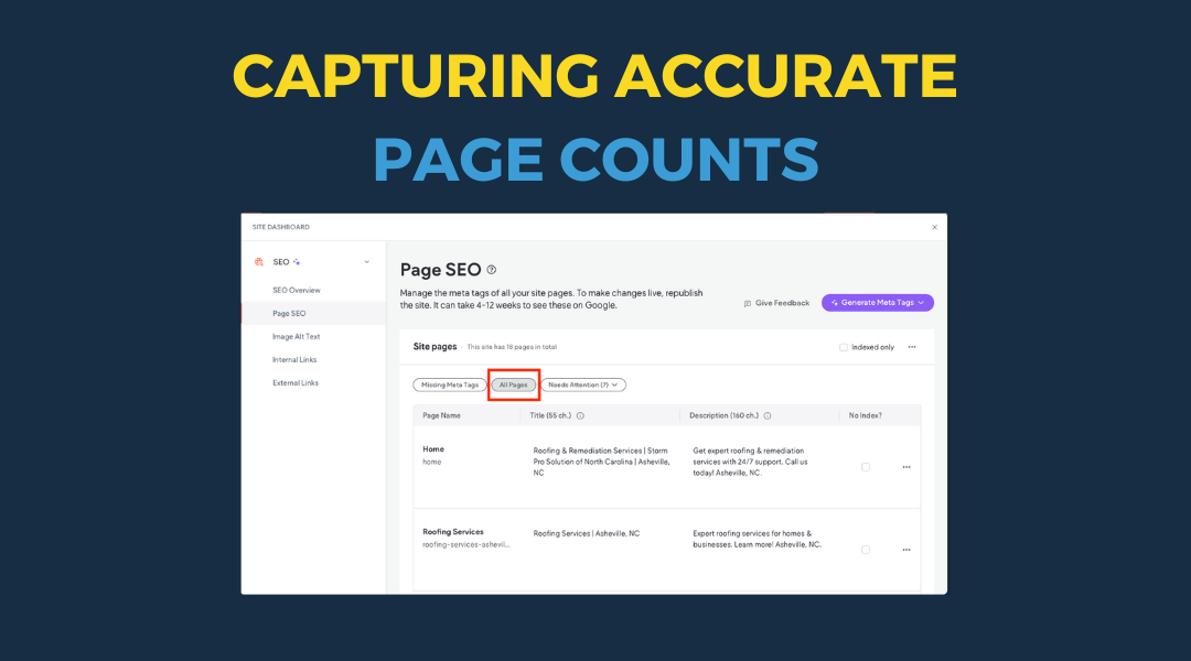
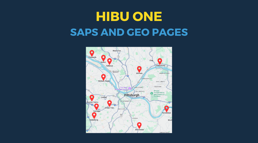
Ensuring all production teams follow a consistent method for determining countable pages on a client’s website is crucial. This standardization helps accurately manage workloads and turnaround times. It's important to distinguish this "page count" from the client's allotted page count, as some pages, while not counted against the client's limit, still require time and expertise to create.
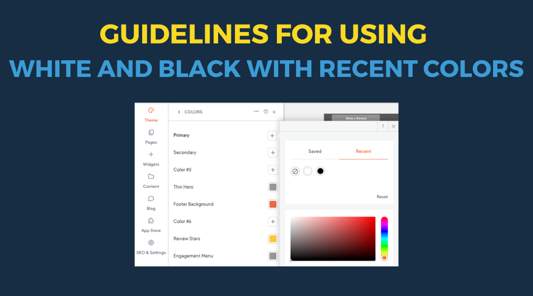
Guidelines for Using White and Black with Recent Colors When designing a site, it’s essential to make strategic use of theme colors for consistent, quick, and efficient design updates. To maximize the flexibility of your site's color palette, we recommend leveraging the locked Recent Colors pure white (#FFFFFF) and pure black (#000000) for foundational design elements, such as text, backgrounds, icons, and other structural components.

Discover how to boost engagement with two key website tools: callouts and coupons. Built with the Swiss Army Widget, these elements help you highlight key information and drive conversions through strategic promotions. Learn the essential differences and best practices for maximizing their impact on your site.
As digital marketing evolves, state privacy laws are becoming increasingly stringent. For businesses working with third-party marketing services, having an up-to-date, compliant privacy policy isn't just good practice—it's essential. Our streamlined process helps clients implement custom privacy policies that meet these requirements while maintaining their website's professional appearance.
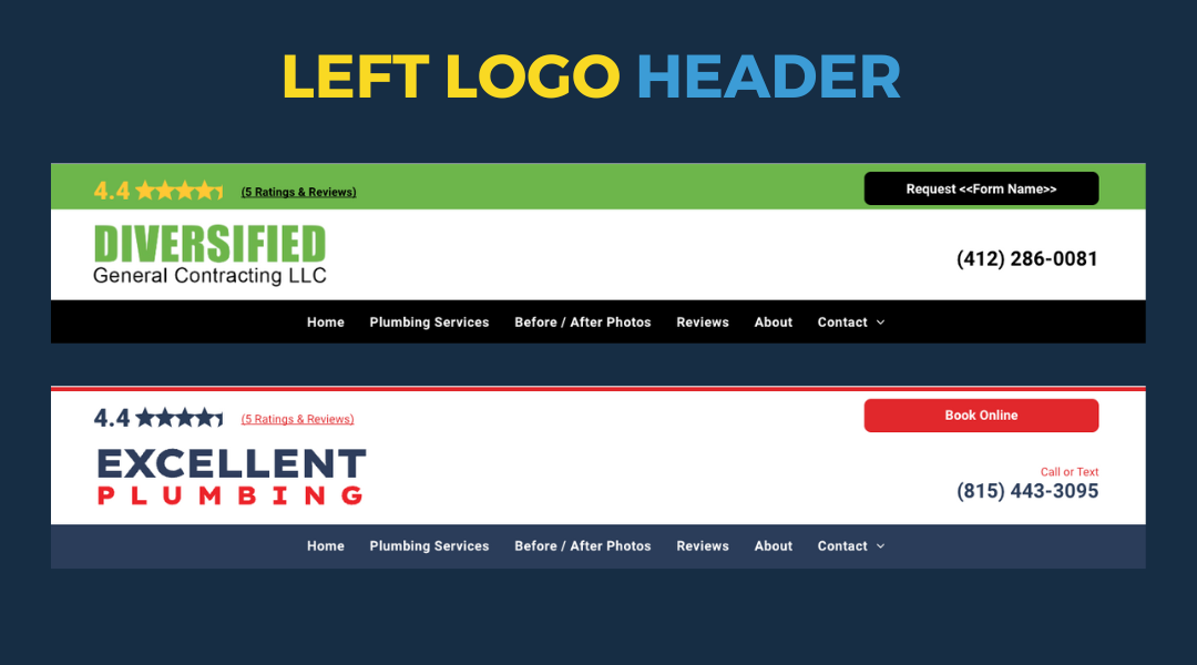
A new pre-designed "Left Logo" header section is now available to make it easier to accommodate client requests for left-aligned logos. No need to start from scratch—this ready-made section ensures consistent, high-quality design for desktop views.
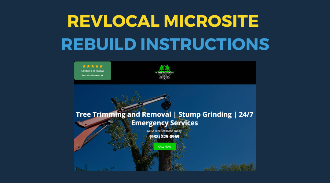
Hibu has developed a streamlined process for converting RevLocal microsites to Hibu one-page websites. Their guide covers essential steps including image management, color adaptation, content transfer, and quality assurance. This efficient approach maintains the client's brand identity while leveraging Hibu's platform strengths, ensuring a seamless transition for clients
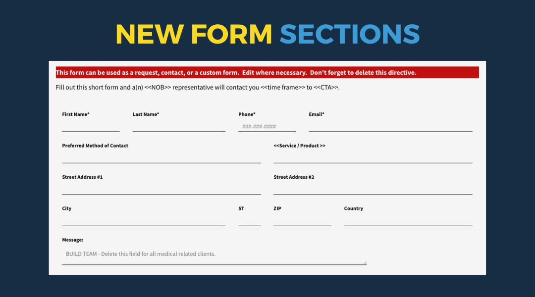
We've added new forms to make your work easier, including enhanced contact forms and job application fields. Plus, we'll walk you through how to replace your old forms with the new ones in just a few steps.
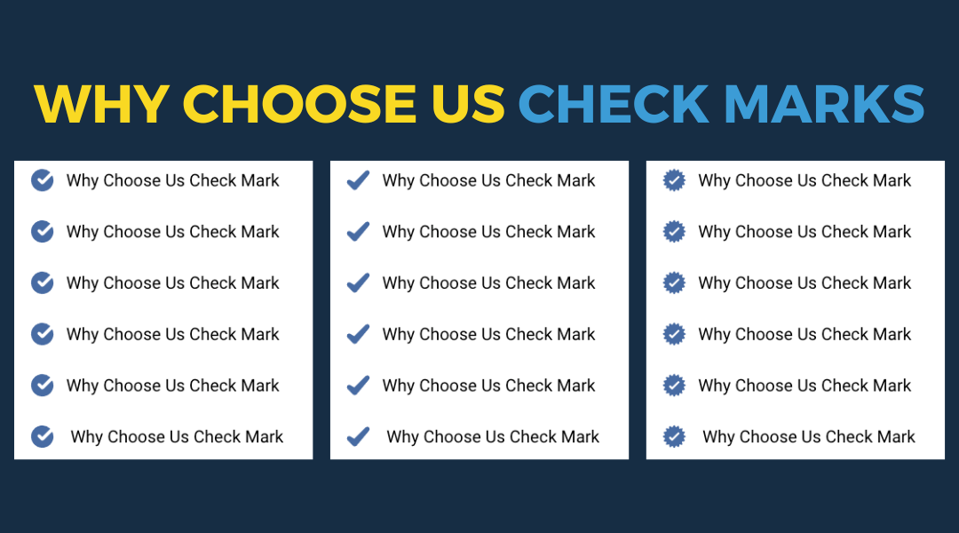
When customizing the "Why Choose Us" section for certain templates / PBNs, it's important to replace the default frog icon with a check mark. Why Use Check Marks? Check marks are clear and easily recognizable, even at smaller sizes. In contrast, non-check mark icons can be difficult to identify due to their reduced size, which may lead to confusion for users. How to Select the Right Check Mark Open the List Icons Widget: Navigate to the Content tab. Choose Icon: Select the "Choose Icon" option. Search: Enter "check mark" (without quotes) in the search bar. You'll find a wide variety of check marks available. Here's how to select the best one: Opt for Simplicity: Choose check marks that are straightforward and easily identifiable. This includes simple check marks or those contained within a circle, shield, starburst, square, or similar shapes. Avoid Complex Icons: Steer clear of check marks that are overly complicated or integrated into other elements, such as a clipboard, home, car, or tool (like a wrench). These can be harder to recognize. Keep It Varied When updating a site that features the "Why Choose Us" section, it's essential to vary the check marks used. Avoid using the same check mark repeatedly—mix it up to keep the design fresh and engaging. By following these guidelines, you'll ensure that the "Why Choose Us" section is both visually appealing and user-friendly, helping to clearly communicate the key motivating factors to our client's audience.
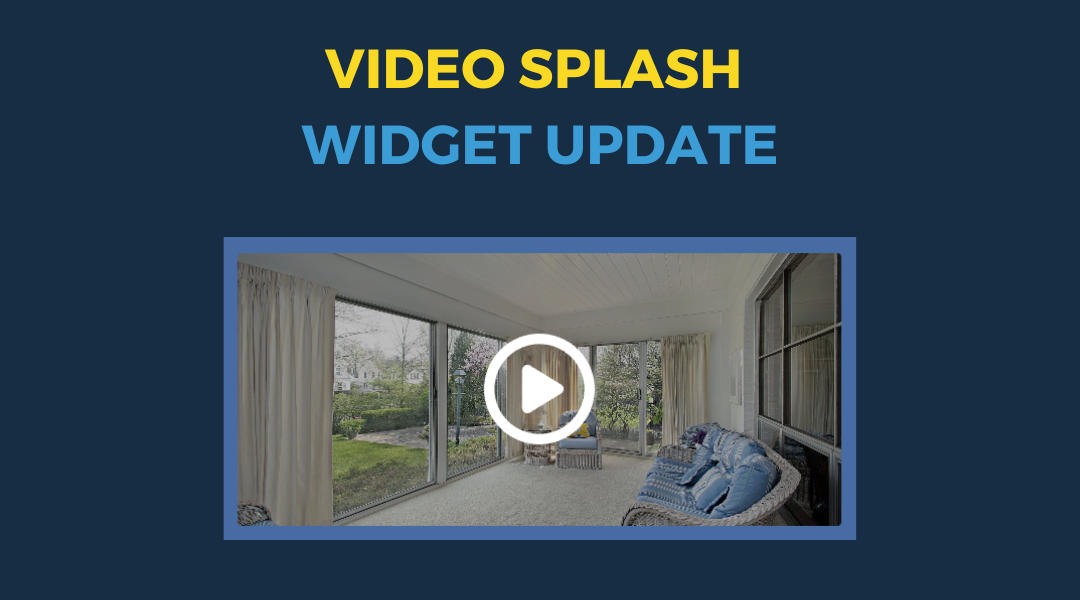
We're excited to announce a major improvement to our video splash widget. We've replaced the static PNG play icon with a versatile SVG icon. This simple change opens up a world of customization possibilities for your video splash. Why This Matters Flexible Design: Easily adapt the play icon's color, size, and even its overall style to seamlessly integrate with your website's look and feel. Crisp on Any Screen: SVGs are resolution-independent, meaning your play icon will look sharp and clear on everything from high-resolution displays to mobile devices. Brand Consistency: Make sure your video previews reinforce your brand identity by using a play icon that complements your other visual elements. Updating Your Widget: A Quick Guide If you're updating an existing video splash widget, you might encounter a broken link for the old play icon. Click Choose Icon and search for a new "play" icon. Choose an icon that is clear, recognizable, and conveys the action of "play." Remember , the primary goal of a play icon is to signal that your visitors can click to start a video. Choose an icon that's instantly recognizable. Avoid overly complex designs that might confuse your audience.