Guidelines for Using White and Black with Recent Colors
Guidelines for Using White and Black with Recent Colors
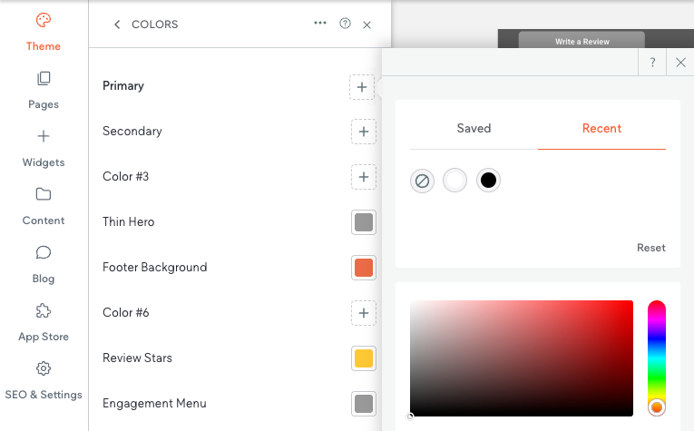
When designing a site, it’s essential to make strategic use of theme colors for consistent, quick, and efficient design updates. To maximize the flexibility of your site's color palette, we recommend leveraging the locked Recent Colors pure white (#FFFFFF) and pure black (#000000) for foundational design elements, such as text, backgrounds, icons, and other structural components.
Why Use Recent Colors White and Black?
- Limited Theme Color Placeholders: Assigning white and black to the default Recent Colors ensures you can save your theme color placeholders for other unique colors in your palette. This approach helps you use your theme colors more effectively.
- Locked and Persistent: The Recent Colors white and black cannot be deleted or changed. This ensures that these colors remain stable, even if theme colors are reset. By contrast, Saved Colors (non-theme colors) can be overwritten or lost when reset, which is why we advise caution when using them for white or black.
Best Practices for White and Black
- Connect Elements to Recent Colors:
If you are using pure white or pure black, always use the locked Recent Colors white and black for maximum stability. You can either connect these colors directly to site elements or define them as theme colors if needed. - Avoid Using Saved Colors for White and Black:
Do not assign white or black using Saved Colors, as saved colors can be reset or lost during updates. - Flexibility for Designers:
Using Recent Colors for white and black does not limit your creativity. You can still assign unique shades or variants of white or black through theme colors if your design requires it. Remember, your theme color palette is yours to define.
Final Note:
Linking site elements to theme colors streamlines updates and ensures design consistency. A single change in the Theme Colors panel updates all linked elements, saving time and maintaining cohesion. Reserve theme color slots for non-default colors to enhance flexibility. While elements default to white and black, you are not restricted to these; as the designer, you have the final say on your site's color palette. To maintain an easily updatable and visually consistent site, always assign updates—such as button colors—using Theme Colors.


