Why Choose Us Check Marks
August 13, 2024
- When customizing the "Why Choose Us" section for certain templates / PBNs, it's important to replace the default frog icon with a check mark.
Why Use Check Marks?
Check marks are clear and easily recognizable, even at smaller sizes. In contrast, non-check mark icons can be difficult to identify due to their reduced size, which may lead to confusion for users.
How to Select the Right Check Mark
- Open the List Icons Widget: Navigate to the Content tab.
- Choose Icon: Select the "Choose Icon" option.
- Search: Enter "check mark" (without quotes) in the search bar.
You'll find a wide variety of check marks available. Here's how to select the best one:
- Opt for Simplicity: Choose check marks that are straightforward and easily identifiable. This includes simple check marks or those contained within a circle, shield, starburst, square, or similar shapes.
- Avoid Complex Icons: Steer clear of check marks that are overly complicated or integrated into other elements, such as a clipboard, home, car, or tool (like a wrench). These can be harder to recognize.
Keep It Varied
When updating a site that features the "Why Choose Us" section, it's essential to vary the check marks used. Avoid using the same check mark repeatedly—mix it up to keep the design fresh and engaging.
By following these guidelines, you'll ensure that the "Why Choose Us" section is both visually appealing and user-friendly, helping to clearly communicate the key motivating factors to our client's audience.
Acceptable
etc.
Unacceptable
etc.
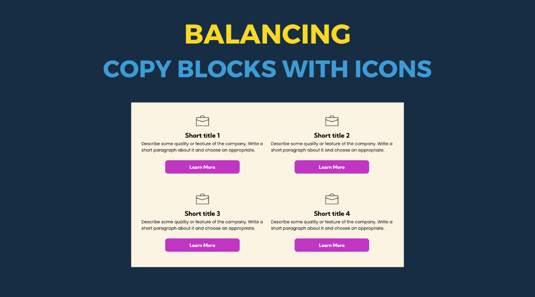
All icon-based copy block sections should maintain a balanced, consistent appearance. If the total number of blocks leaves an incomplete final row, adjust the layout so the section still looks intentional and visually even.
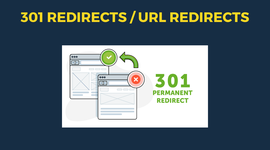
A 301 redirect: guiding web traffic to a new destination with a permanent, virtual "follow me" sign.
Overview

This setup provides clients with a lightweight, SEO-optimized, scalable way to showcase inventory using the blog feature. It requires design discipline, metadata precision, and clear client education to function effectively. Restores client-side flexibility after the removal of manual page creation capabilities