July Website Update Wrap Up
This post is part of our Website Update Wrap-Up series, showcasing a collection of recent
small product and feature improvements.
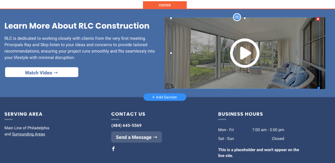
Homepage and Interior Page Video Splash Row Is Moving to the Footer
The Video Splash row will now be exclusively located in the footer and will no longer appear on the homepage or on product and/or services pages. This change means you will only need to update the Video Splash row design, widget, headline, and copy once, instead of updating it across multiple instances on the site. The process for the copywriter and designer to update the Video Splash row will remain the same. Only the Hibu photo motion video (or a customer-provided video, if substituted) will be featured in the footer. All other videos will continue to be placed throughout the site as usual.
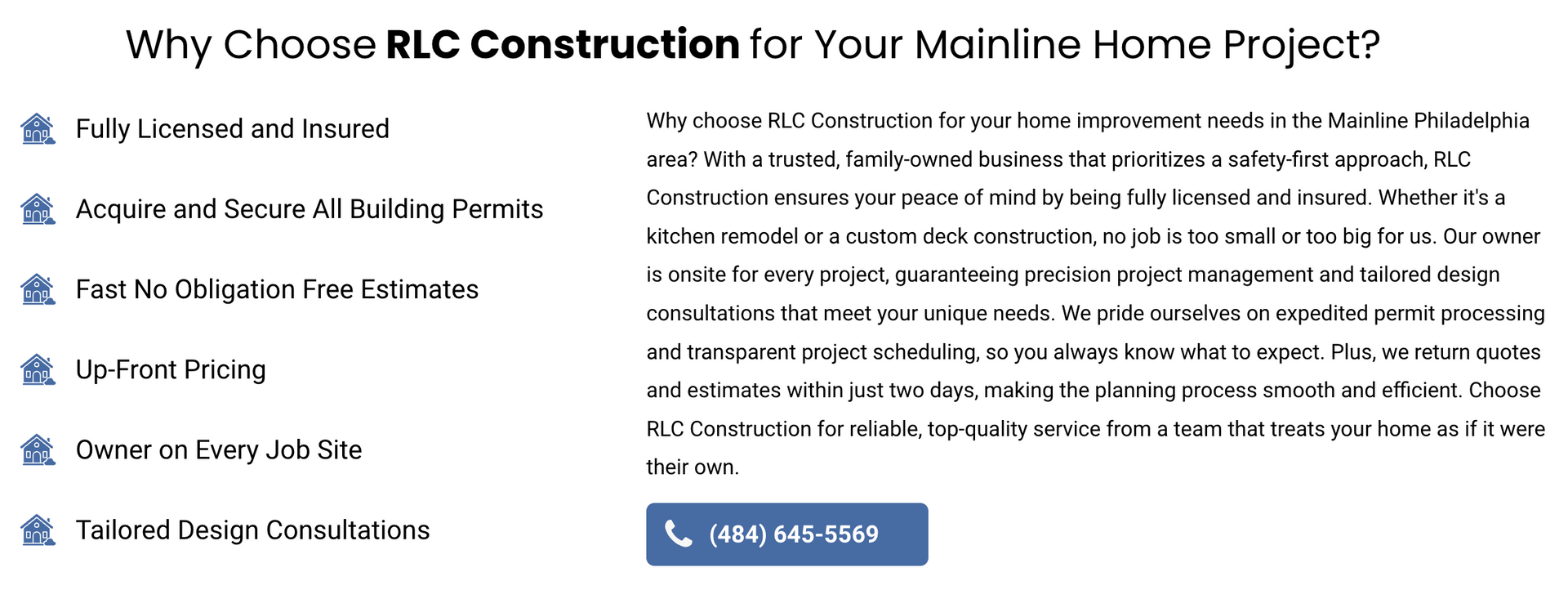
Bullet Points and Copy Will Switch Places in Homepage "Why Choose Us"
To enhance the mobile user experience, we updated the homepage "Why Choose Us" row (associated with PBNs Automotive A, Home Services D, G, H, M, O, Law D, F, Med/Dental F, H, and Other A) to feature bullet points on the left and copy on the right. This way, users will see the bullet points first on a mobile device. Bullet points are perceived as images, and since images naturally attract attention, we have a better chance of keeping users on the site. Additionally, the CTA button now sits nicely under the text on mobile, creating a more natural flow than before.
Desktop / Tablet View
Mobile View

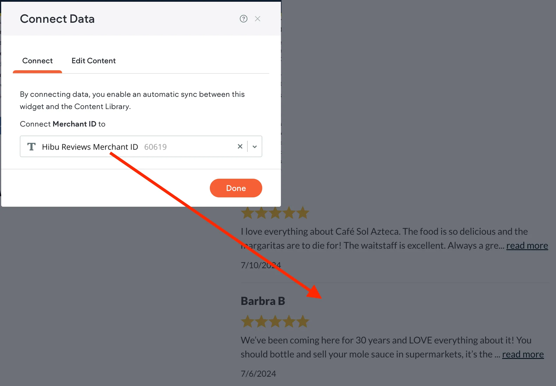
Unified Merchant ID for All Review Widgets on New Sites
The Merchant ID associated with all review widgets—including the desktop and mobile header reviews widget, the homepage recent reviews widget, the internal page right gutter recent reviews widget, and the review page widget—is now connected to the content library. QA will only need to update the content library field named Hibu Reviews Merchant ID to update all site review widgets. This connection applies only to new sites moving forward.
Tablet Header Will No Longer Feature Desktop Header
The tablet header will no longer feature the desktop header or a transparent background. Instead, similar to the mobile version, it will have a "hamburger menu." This menu will be accompanied by the reviews widget, logo and slogan, and a connect data phone button. The design, like the mobile header, is fixed and should not require additional modifications. If the client does not have reviews, it is recommended to replace the reviews widget with the geo featured on the desktop. Additionally, the hamburger menu flyout should mirror the mobile version.