Left Logo Header
Overview
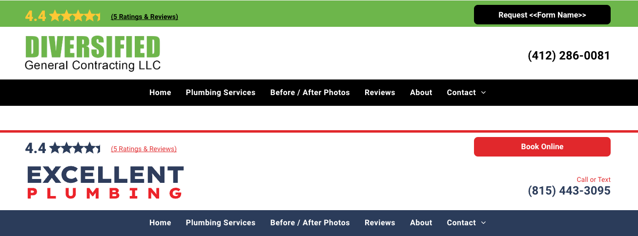
A new, pre-designed "Left Logo" header section (Section→Headers→V6 - Left Logo) is available for use when a client requests that their logo be placed on the left side of the header, instead of in the center. This enhancement simplifies the design process, as you now have a ready-made section to use rather than needing to create the design from scratch.V6
Rules and Guildlines for Using the Left Logo Header
These guidelines must be followed exactly to maintain consistency and meet client expectations.
- Client Request Specific
- This header must only be used if the client specifically requests their logo to be on the left side.
- If this is not requested, continue using the standard header layouts.
- Desktop Only
- The Left Logo header is designed only for desktop views.
- Tablet and mobile headers remain unchanged. Continue building the tablet and mobile views as per normal guidelines, with logos centered.
- Logo Size Restrictions
- Only small or landscape logos may be used with the Left Logo header.
- If the client’s logo is overly large or contains a baked-in tagline, this header should not be used.
- If the client’s logo is oddly shaped (e.g., tall and narrow or very wide), use caution when adding it. The space allotted for the logo may not allow it to present well in the design.
- If the client doesn’t provide a new, appropriately sized or shaped logo, explain that their request cannot be accommodated
- Reviews/CTA Section Row
- Continue building the reviews/CTA section as you normally would, following standard guidelines. This header only impacts the logo placement.
- Navigation Row
- The navigation remains centered and should be built as per the usual guidelines, regardless of the logo placement.
- Transparent Headers
- The Left Logo header cannot be added to transparent headers on homepages or their associated internal pages.
- No Geographic Elements (Geo)
- The Left Logo header must not include geographic elements. Keep the design simple and clean.
- Designer Responsibilities
- Ensure that the designer increases the header size and centers the navigation to align visually with the left-aligned logo.
- Designers are free to adjust the background of the row to match the logo’s colors or background for better integration.
- Update the phone number text color accordingly to ensure contrast and visibility.
- Logo Cropping for Optimization
- If the client provides a logo with excess space (whether colored or transparent) around the actual logo, the designer is free to crop out unnecessary space to maximize the logo’s visibility.
- This is allowed only if the integrity of the logo is not compromised in the process.
Why These Rules Matter
Consistency is key to maintaining a professional, clean, and user-friendly design. Following these rules ensures that we meet the client’s requests without sacrificing the overall look and functionality of the website.
If you have any questions or run into issues when applying the Left Logo header, feel free to reach out to
Paul Altobelli for clarification.


