Slide title
Write your caption here
Button

Slide title
Write your caption here
Button
Slide title
Write your caption here
Button
Slide title
Write your caption here
Button
Slide title
Write your caption here
Button
Slide title
Write your caption here
Button
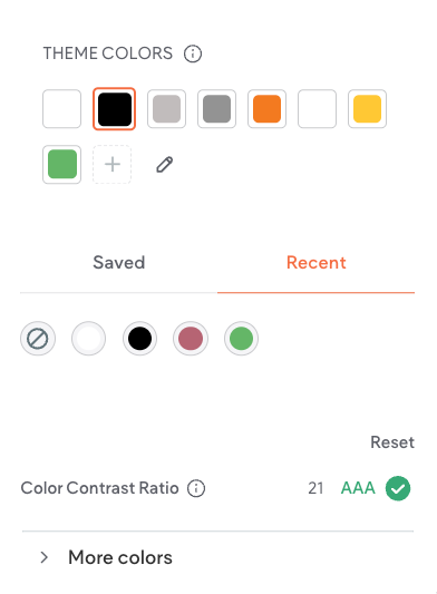
Hibu Policy
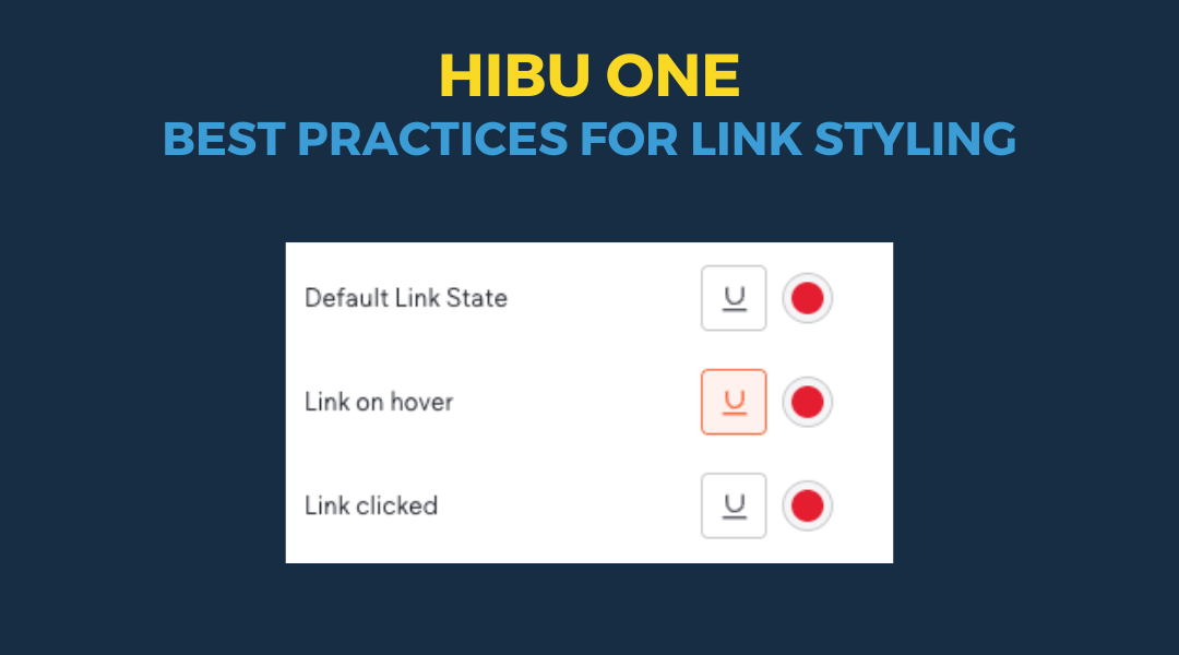
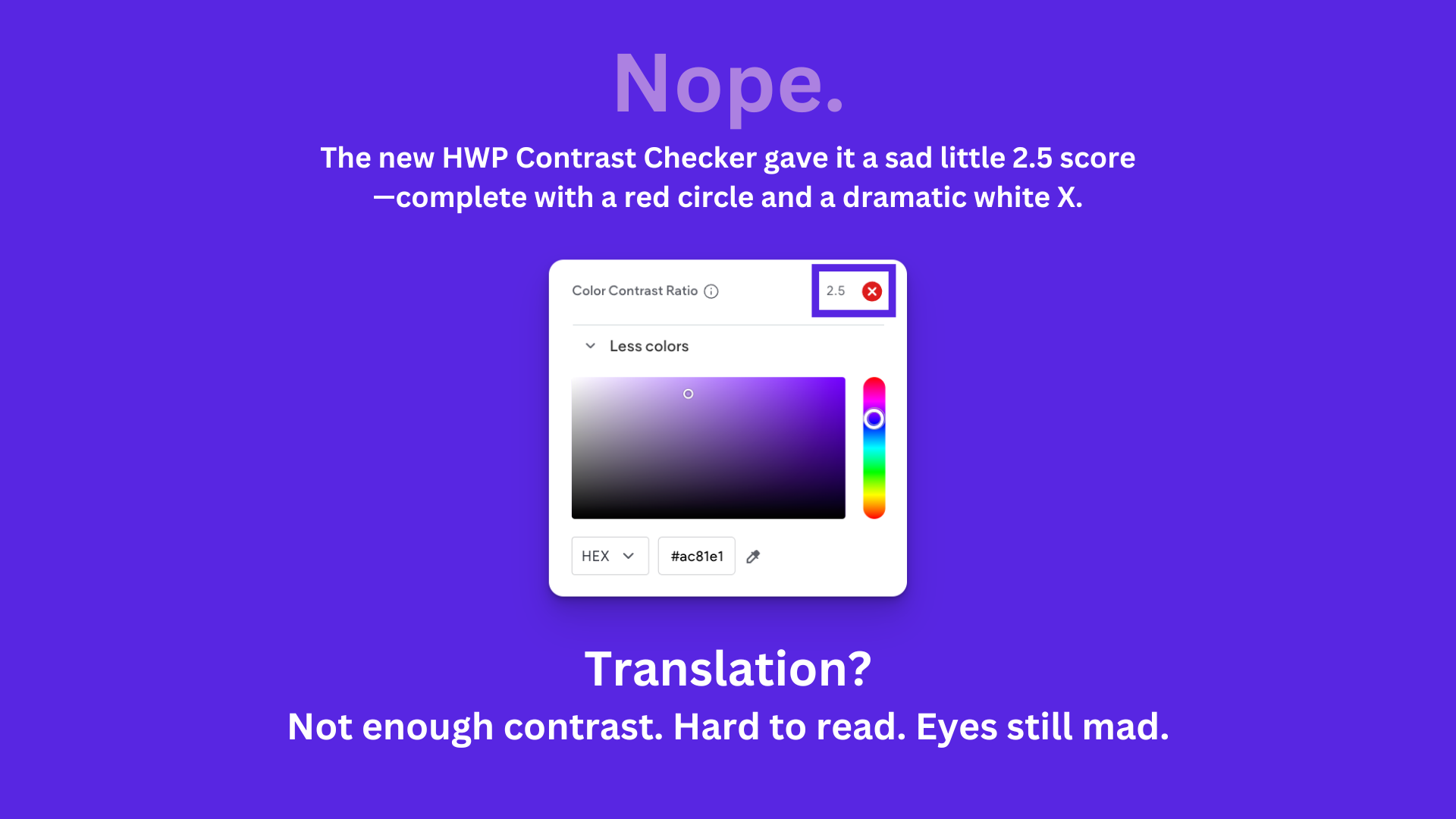
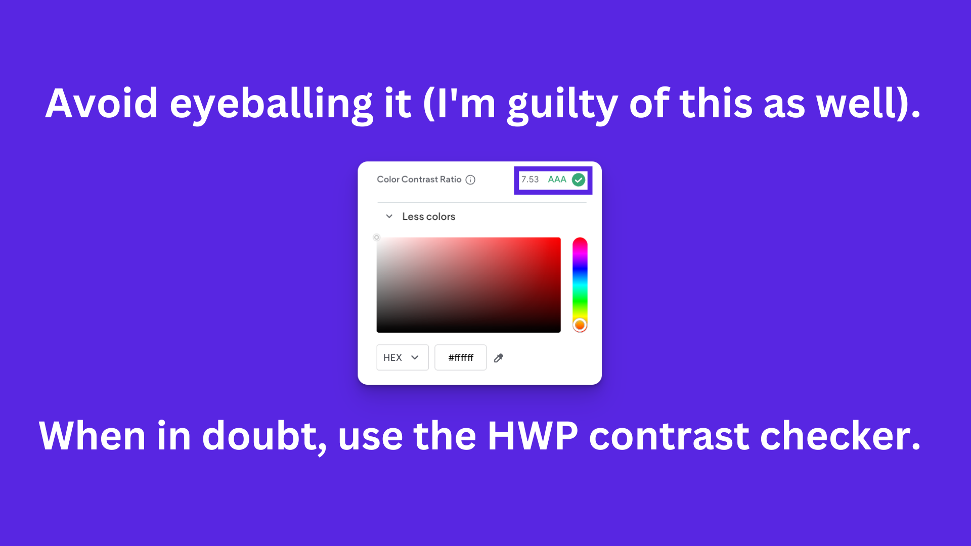
All text on a Hibu One Smart Site must maintain clear, readable contrast across devices and screen types. Designers must follow WCAG contrast principles and the platform’s built-in contrast indicator. While WCAG AA standards remain the target, Hibu allows a controlled exception zone for cases where strict AA compliance results in a poorer visual outcome. Under no circumstance may text fall below the minimum contrast threshold defined in this rule.
Purpose / Why It Matters
Strong contrast ensures users can read text easily across screens, lighting environments, and accessibility needs. This rule maintains visual consistency while allowing designers controlled flexibility within safe limits.
Rules & Guidelines
1. Standard Requirement (Green Target)
Designers should choose color combinations that display a green indicator whenever possible.
- Green = fully acceptable and preferred.
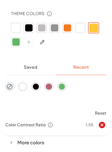
2. Exception Zone (Red Allowed With Limits)
Designers may use a color combination that shows a
red indicator only when the contrast ratio is:
3.5 or higher
Designers may proceed within this range if:
- The “green” option produces a noticeably worse design result
- The chosen color is still clearly readable
- The color aligns with the site’s theme and visual hierarchy
- Minor adjustments (lightening or darkening either color) should be attempted before relying on the exception.
3. Hard Stop — Not Allowed
Text with a contrast ratio
below 3.4 may not be used under any circumstance.
- Below 3.4 = unreadable / fails immediately (no exception)
- No exceptions. No overrides.
Final Thought
At Hibu, readability is non-negotiable. If visitors can’t clearly read the text, they won’t engage, won’t trust the content, and won’t convert. The contrast checker exists to protect the user experience—but good judgment still matters. When a color choice falls within the safe exception range (3.5–4.49), designers may choose the option that genuinely improves clarity and layout.