Collection Site Build Time Study
Training Overview: Initial Build Setup vs. Editor 2.0 & Collection Site
We're moving from the current initial build setup to a new approach with Editor 2.0 and the Collection Site. This transition is more than just switching editors—it changes how we structure content, manage data, and ensure consistency across sites.
Key Differences: Initial Build vs. Editor 2.0 & Collection Site
- What Writers See Today (Initial Build Setup)
- Outside of the homepage and core page content, copywriters and QA are responsible for writing and populating:
- H1s
- Title Tags & Meta Descriptions
- Callout & Coupon Copy
- Motivating Factors
- Superhero Dropdown Options
- Request CTA Labels (e.g., "Request Estimate")
- Core Page Content (displayed as one block of text)
- Contact Us page section
- Homepage Reviews section
- Organizing page architecture
- Since content is not centrally managed, any updates require manual edits across multiple pages.
- What Writers Will See in Editor 2.0 & Collection Site
- Writers will have more structured content upfront, including:
- H1s (Primary headlines for SEO and UX)
- Title Tags & Meta Descriptions (SEO essentials)
- Callout & Coupon Copy
- Motivating Factors
- Superhero Dropdown Options (Form selections)
- Request CTA Labels (e.g., "Request Estimate")
- Core Page Content (now displayed as individual headlines and blocks of text)
- Contact Us page section (structured separately)
- Homepage Reviews section (structured separately)
- Organizing page architecture
- Design Constraints:
Thin heroes, request forms, and contact us forms, along with the right gutter design, must remain unchanged. Design updates can include background color and font changes, but adjustments such as realignment, form layout changes, background images, or increasing the height of thin heroes are not allowed. - Content is structured using
HWP's Content Library and Collections, ensuring consistency
and reducing manual updates. - Updates made in the Content Library or Collections automatically apply across all relevant pages.
- Writers will work with
structured data fields instead of manually placing content on each page.
- What This Means for Writers, Designers, and QA
- Writers ensure content is engaging and aligned with Hibu standards, placing it in structured fields that connect across the site.
- Designers will work with consistent, pre-set content for key elements like CTAs, hero sections, and callouts, reducing back-and-forth edits.
- QA will spend less time checking for inconsistencies across pages since connected data ensures uniformity.
- Amends will be faster and easier—updating content once in the Content Library or Collections ensures changes reflect everywhere automatically.
- What This Means for Hibu
- Faster site production—With more content structured at the initial build, sites are closer to launch-ready from the start.
- Less manual work—Teams spend less time on repetitive edits, freeing up resources for higher-value tasks.
- Scalability—A more efficient content structure supports our ability to build and maintain sites at scale.
- What This Means for Our Clients
- Stronger brand consistency—Key business details, CTAs, and offers remain accurate across all pages.
- Better SEO and performance—Structured content means every site launches with optimized H1s, title tags, and meta descriptions.
- Easier updates—Future content changes can be made quickly without risk of errors or missing updates on some pages.
- A more polished website with first proof—With a more comprehensive initial build, clients receive a fully structured and complete site faster.
Updating Header Lead-Ins
Directly above the Geo Text and
Phone Number in the header, you’ll find the
Geo and CTA lead-in text placeholders. These placeholders are
connected to the Header Lead-Ins collection and
can only be updated through the collection.
(Content → Collections → Header Lead-Ins)
Pro Tip: To edit the
Geo Lead-In or
CTA Lead-In, roll your mouse over the
eyeball icon to the left of "All Pages" to reveal the
pencil icon. Click the pencil to edit both lead-in text fields.
Geo Lead-In & Geo Text
- The Geo Lead-In is a short phrase that introduces the geographic location, ensuring it reads naturally while remaining concise and optimized for SEO.
- The Geo Text placeholder is now a manual text field and is no longer connected to business geo (Yext) data. Writers will enter the geo text manually based on client requirements.
- Example Structure:
- Serving (geo lead-in) King of Prussia, PA and Surrounding Areas (geo text)
- Proudly Serving (geo lead-in) Columbus, OH and Nearby Communities (geo text)
- Providing Services in (geo lead-in) Austin, TX and Central Texas (geo text)
- This update gives writers more control over geo text, making it easier to match client-specific needs without having to override automated content.
CTA Lead-In
- The CTA Lead-In is a short phrase that introduces the phone number, similar to how we already handle callouts and coupons.
- If no specific instruction is provided (e.g., “Call or Text”), the writer will add a default CTA phrase to introduce the phone number.
- This ensures that the phone number is action-driven, encouraging users to take the next step.
- Example Structure:
- Call Today (CTA lead-in) (555) 123-4567
- Schedule Your Free Consultation (CTA lead-in) (555) 987-6543
- 24/7 Emergency Services (CTA lead-in)
(555) 222-3333
Hero Setup at Initial Site Build
- The
Initial Site Build will now always include the
Standard Hero by default. Since the standard hero is the most commonly used layout, it is included automatically.
- If the client selected a
PBN featuring a "row shapes" hero, the
copywriter will replace the standard hero with the row shapes version.
- Both hero versions—one with a form and one without—will be present at the initial site build. The copywriter will
delete the hero not selected by the client before finalizing the site.
Updating the H1 Headline and Geo Location H2
The H1 Headline and Geo Location H2 are now structured as follows:
- The H1 Headline is included at the Initial Site Build and is connected via the Hero Collection.
- The Geo Location H2 is positioned
directly under the H1 and follows specific geo formatting rules.
- Copywriter Responsibilities for the H1 Headline
- The copywriter is responsible for editing the headline as they normally do with site copy, ensuring:
- Accuracy
- Clarity
- Consistency
- Concise phrasing
- Readability
- Removal of redundancies
Geo Location H2: Placement & Formatting Rules
If applicable, the
Geo Location H2 should reflect the
Geo Text placeholder from the
Header, without the Geo Lead-In. However, the copywriter has the flexibility to adjust or remove it based on length and necessity.
- General Rules for Geo Placement
- The geo location should always appear on the second line under the main H1 headline.
- The geo text should be concise and must not wrap to another line on desktop.
- Use title case (capitalize major words).
- Do not include punctuation unless it is part of a proper name (e.g., St. Louis, MO).
- When the Copywriter Should Remove the Geo Location H2
- If the geo text is too long or complicated, the copywriter may remove the placeholder under the H1.
- If including a geo reference is unnecessary, the copywriter will remove the placeholder.
- This ensures that the H1 remains clean and readable without forcing awkward or excessive geographic information.
- When to Use "Area" or "Surrounding Areas"
- Use “[City], [State] Area” when:
- The business is based in a specific city but serves nearby locations.
- Example: Roofing Experts → Cherry Hill, NJ Area (suggests they are central to Cherry Hill but serve beyond it).
- Use “Surrounding Areas” when:
- The business covers multiple towns without a clear central hub.
- Example: Plumbing Services → South Jersey & Surrounding Areas (if they serve various towns beyond South Jersey).
- When to Use Just the City and State
- Use “[City], [State]” when:
- The business has a physical office location in that city.
- Example: Personal Injury Attorney → Voorhees, NJ (suggests an office in Voorhees).
- Do not add “Area” or “Surrounding Areas” if referring to a physical office location.
- What to Do If There Are Two Locations
- If they have two main service locations:
- Separate them with "&" or a slash ("/") if space is limited.
- Example: Heating & Cooling Experts → Cherry Hill, NJ & Philadelphia, PA.
- If one location is primary:
- List it first, followed by "& Surrounding Areas."
- Example: Pest Control Services → Cherry Hill, NJ & Surrounding Areas.
- If both locations are major but cover a large region:
- Use a broader geo descriptor.
- Example: Roofing Specialists → South Jersey & Philadelphia Area.
Hero Buttons: Connected, Labeled, and Customizable
The
Hero Request CTA Button and
all Request CTA buttons are now
connected to a collection that is populated at the
Initial Site Build. These buttons are
pre-set with common call-to-action labels and are automatically linked to the
Request Form page for consistency across the site.
- How Copywriters Can Adjust Hero Buttons
- Delete or rearrange buttons based on the client’s CTA preferences.
- Modify button text via the collection only when necessary to:
- Fix a typo
- Redefine the CTA (e.g., "Request Estimate" becomes "Get a Quote")
- Phone Number Button Updates
- Phone number text will no longer appear in the hero, callout, or coupon sections on desktop.
- If the client has a Call/Text option, the copywriter will:
- Disconnect the phone button
- Rename it to "Call or Text"
- Hyperlink it to the Call/Text popup
Connected Hero Form
The Hero Form is now fully connected at the initial site build. This means the following elements are pre-set and structured:
- Form Title
- Dropdown Options
- Form Button
- Form Background
The only time
Writers, QA, or Amends need to update the form via a
collection is when they need to:
- Rearrange dropdown options
- Fix a typo
- Add or delete dropdown options
Designers will control the
form background color through a
defined and connected color theme, ensuring consistency across all sites.
Hero Background and Copy Block Background Image
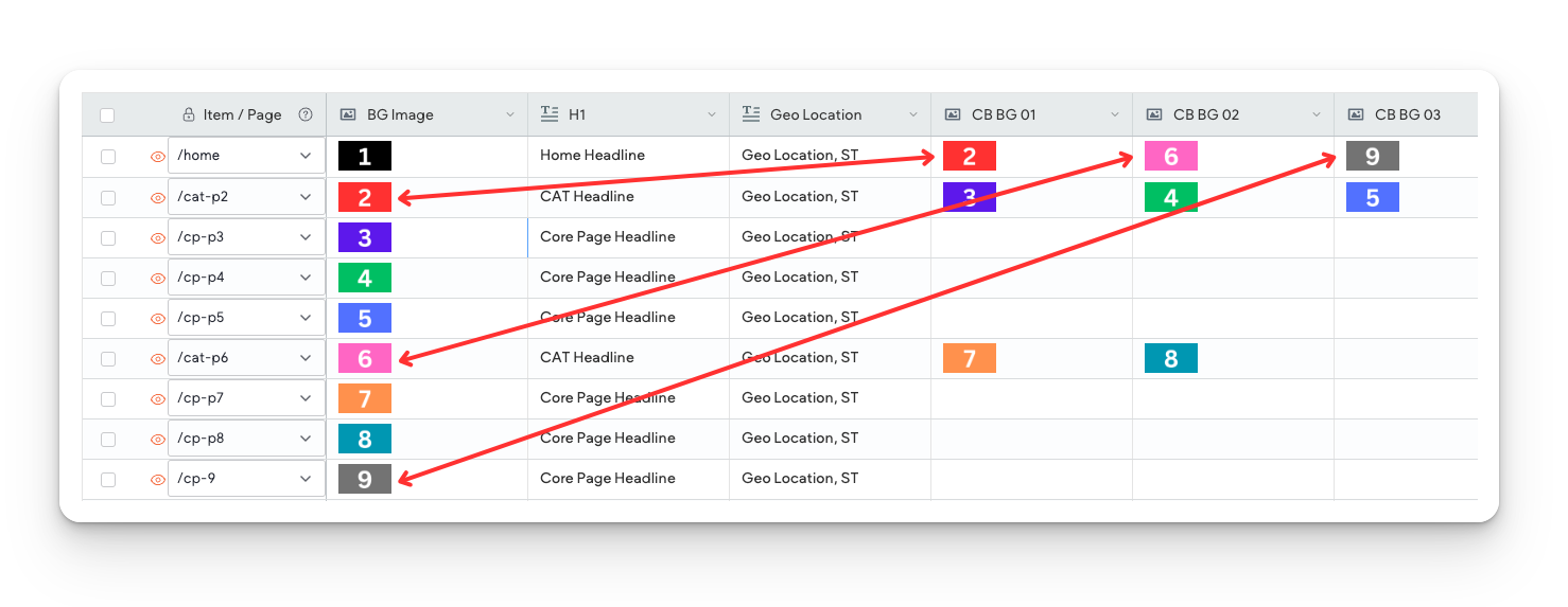
The Header collection manages Hero Background Images and Copy Block Background Images across different page types on the website.
- Header Collection Legend
- This collection includes several columns representing the different elements of the hero and copy block setup:
- Item/Page – Indicates which page the hero and copy block appear on.
- BG Image – The hero background image for that page.
- H1 – The hero headline appearing in the hero section.
- Geo Location – The geo location displayed under the H1.
- CB BG 01 – CB BG 10 – The copy block background images displayed on category landing pages.
- How Hero and Copy Block Images Work
- The homepage and category landing pages contain both a hero Image and copy blocks.
- The Hero background image and copy block background image are the same image for consistency.
- Homepage copy blocks link to top-level category landing pages and core pages not included in a category landing page.
- Category landing pages copy blocks link to the core pages associated with them.
- Core Pages only have a hero image and do not contain a copy block.
- How to Populate Hero and Copy Block Images in the Collection
- Assign the Hero Background Image
- Locate the BG Image column.
- Upload or select the appropriate background image for the hero section.
- This same image will also be used in the corresponding copy block for that page.
- Assign Copy Block Background Images
- Locate the CB BG columns (CB BG 01 - CB BG 06).
- Ensure that the CB BG image matches the Hero Background Image for that page.
- Assign a copy block image only if the page includes a copy block (homepage or category landing pages).
- Core pages do not require a copy block image.
- Confirm the H1 and Geo Location
- Verify that the H1 column contains the correct hero headline.
- Ensure the Geo Location follows the formatting rules outlined in the geo section.
Editing Callouts
The Callout Headline, Body Copy, and CTA Lead-In—featured in the right gutter of core pages—are now connected to the Content Library instead of Collections.
- Where to Find & Edit Callout Content
- Path: Content → Business Text
- Each piece of callout content is connected to its own field in the Content Library:
- CO - Headline (Callout Headline)
- CO - Body Copy (Callout Body)
- CTA Lead-In (CTA Introduction)
Like
Motivating Factors, callout content can be
edited directly on the page without needing to go into the Content Library.
- How to Edit a Callout
- Click Callout in the right gutter.
- Select Content.
- Choose Edit at the top of the panel next to "This widget is connected to your Content Library."
- Edit the content as you normally do, ensuring:
- Accuracy
- Clarity
- Consistency
- Concise phrasing
- Readability
- Removal of redundancies
- If necessary, add hard breaks to avoid awkward spacing or widows.
- Click
Save when finished.
- Phone Numbers in Callouts
- Phone numbers will now always display as a button on all devices.
- Text-based phone numbers will no longer appear on desktop or tablet.
- For this study, we will only include phone numbers in callouts.
- Callout Background Color & Icon Updates
- The callout background color is now connected to a color theme placeholder. This ensures consistency across the site and aligns with the overall branding.
- The callout icon is actually an image, which—like the video splash image—is connected to Content Library → Business Images.
- How Designers Update the Callout Icon
- Swap out the connected business image in the Content Library.
- The image must be square to ensure proper alignment.
- If using a client logo, place it in a square container with a transparent background.
- Since we are not using an actual SVG icon, the designer must apply the correct color to the image before uploading it.


