Site Link Audit Tool

February 21, 2025

Site Link Audit Tool

Keeping your website free of broken links helps improve your SEO and creates a better experience for your visitors. The Site Link Audit Tool in Duda makes it easy to find and fix broken internal and external links — fast.

See how to fix broken links step-by-step in this quick demo video:

Step-by-Step: Finding and Fixing Broken Links

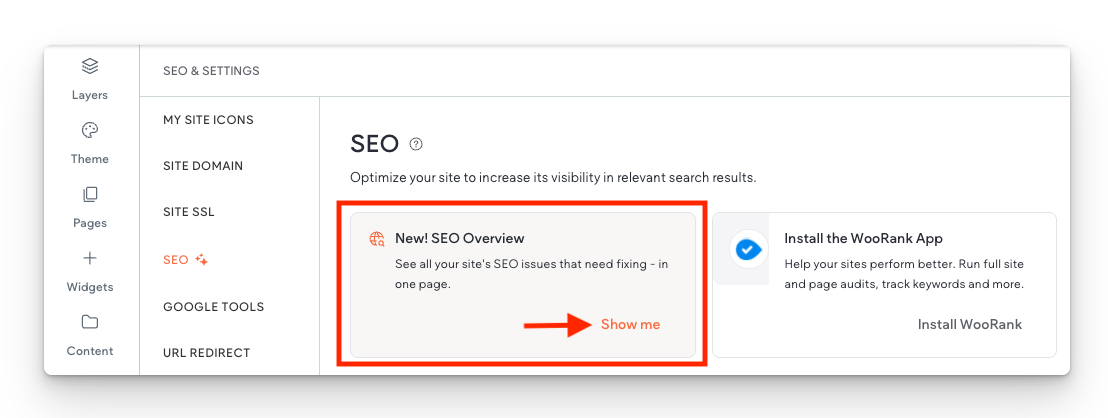
1. Open the Site Link Audit Tool

Go to: SEO and Settings > New! SEO Overview > Show Me > SEO Overview

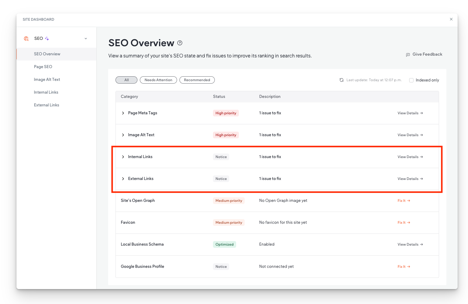
2. Check Link Health in the SEO Overview

  • You’ll see a list of internal and external link issues
  • Click View Details next to "Internal Links" or "External Links"

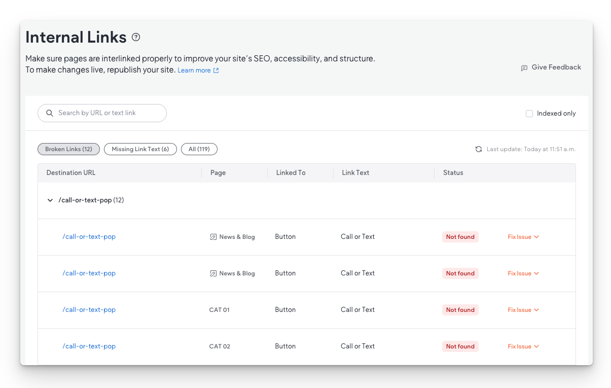
3. Review Broken Internal Links

  • You’ll see a list of all broken links
  • The table shows which pages link to a missing page and what anchor text is used


In the video example, all broken links pointed to a deleted About page. The checker flagged these on four different pages.
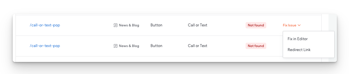
4. Fix the Links

Click Fix Issue to see two options:

  • Fix in Editor – Jumps you to the exact location of the broken link in the page editor
  • Redirect Link – Set a 301 redirect to a working page and fix all instances at once


In the demo, we used
Redirect Link and pointed the missing “About” link to the new “Our Story” page

5. Refresh and Recheck

  • Once you fix the issue, go back to the SEO Overview and refresh. The internal link issue should now be gone.
  • Repeat the same process for external links.
  • In the video, the broken external link was fixed by updating the URL to the site’s Contact page using Fix in Editor.

Why This Tool Matters


  • Saves time – No need to manually search for broken links
  • Boosts SEO – Clean links improve crawlability and trust
  • Improves UX – Avoids frustrating dead ends for visitors
  • Reduces bounce rate – Working links keep people on your site

Pro Tip


Check this tool often, especially if:

  • You recently deleted or renamed pages
  • You imported content from another source
  • You're managing a blog or news section

Final Thoughts


Fixing broken links isn’t just about cleanup — it directly impacts how your site ranks and how users experience it. Use the Site Link Audit Tool regularly to keep your website running smoothly.

By Hibu Sections April 9, 2025
In this section, you’ll learn how to control the size of elements using different types of units in Editor 2.0. We’ll break down how viewport width (vw) and height (vh) respond to the browser window, how the auto unit allows containers to resize based on their content, and how min/max values help you keep your elements within practical size limits. Together, these tools give you greater control over how your site adapts across devices—without relying on fixed pixel values.
April 9, 2025
Flexbox is the foundation for how columns behave in Editor 2.0. It controls how elements stack, align, and space themselves inside containers, giving you full control over layout across different screen sizes. By adjusting properties like stacking direction, content alignment, and wrap, you can create clean, organized designs that adapt smoothly to any device. These features help prevent layout issues, make better use of space, and simplify how you manage rows and individual elements. Learning how to use Flexbox effectively leads to faster builds and more consistent, responsive websites.
By Hibu Sections April 9, 2025
Understanding layout elements and the Layers Panel is key to building clean, responsive websites. Layout elements help you control structure—how widgets are grouped, how content stacks, and how different parts of the page respond across breakpoints. The Layers Panel gives you a clear view of that structure, making it easier to manage complex sections, find hidden elements, and keep your layout organized. Together, these tools let you build with more precision, troubleshoot faster, and maintain consistency across the entire site.
By Hibu Sections April 8, 2025
Breakpoints are specific screen widths where your website layout shifts to fit different devices, like phones, tablets, and desktops. They’re a key part of responsive design, allowing you to adjust styles so your site looks and works well on any screen. In the editor, you can see how styles behave at each breakpoint, apply universal styles, and override them when needed. You can also preview your site at different screen sizes to make sure everything looks right.
Show More →