Best Practices for Link Styling

July 15, 2025

Overview

Effective link styling is critical for clarity, usability, accessibility, and overall user experience. Links must be immediately recognizable without relying solely on hover effects. This guide outlines the standards and restrictions for link styling across all states to ensure:

  • Visual distinction from surrounding text
  • Consistent interaction patterns for all users
  • Strong color contrast for accessibility compliance
  • Positive impact on usability, SEO, and conversions

Link Styling Principles

  • Underline on hover only for standard body links (keeps design clean while signaling interaction).
  • Exception — Footer links: always underlined in all three states (normal, hover, visited).
  • Maintain the same color for all three link states (normal, hover, visited) for visual consistency.
  • Never rely solely on hover to indicate a link — users must be able to identify links at a glance.

Important Restrictions

  • Do NOT use red as a link color (commonly associated with errors and warnings, creates confusion).
  • Do NOT use the default paragraph font color — links must be visually distinct from surrounding text.
  • Do NOT use black or any color that closely matches body text (reduces discoverability).

Footer-Specific Rules

  • Match footer link color to the footer’s font color for a cohesive design.
  • Apply underline in all three states (normal, hover, visited) to reinforce recognizability.

Link Color Selection — Best Practices

When selecting link colors, follow this hierarchy:

  • Primary, Secondary, or Accent Brand Colors
  • Use whenever possible to maintain brand consistency.
  • Since Duda does not provide an automated WCAG contrast check for link colors (unlike other widgets), use your best judgment to ensure the color appears clearly against both the background and surrounding body text.
  • When in doubt, default to Standard Google Blue (#1a0dab) to guarantee visibility and familiarity for users.
  • Standard Google Blue (#1a0dab)
  • Serves as the recommended fallback option when brand colors are difficult to read or appear too light.
  • Works especially well on white or light backgrounds.

Why This Matters

  • Accessibility – Ensures links are usable by all visitors, including those with color vision deficiencies.
  • SEO & Engagement – Clear link styles improve click-through rates, which positively influence user signals.
  • Conversion – Easy-to-spot links help guide users toward key actions without frustration.
  • Consistency – A standardized approach avoids visual clutter and maintains brand integrity across all sites.
By Paul Altobelli October 24, 2025
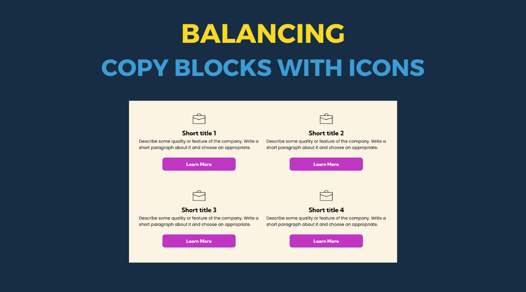
All icon-based copy block sections should maintain a balanced, consistent appearance. If the total number of blocks leaves an incomplete final row, adjust the layout so the section still looks intentional and visually even.
By Paul Altobelli September 26, 2025
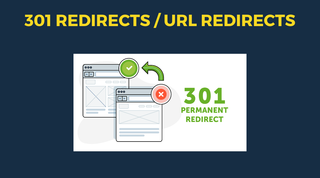
A 301 redirect: guiding web traffic to a new destination with a permanent, virtual "follow me" sign.
By Paul Altobelli July 1, 2025
This setup provides clients with a lightweight, SEO-optimized, scalable way to showcase inventory using the blog feature. It requires design discipline, metadata precision, and clear client education to function effectively. Restores client-side flexibility after the removal of manual page creation capabilities
By Hibu Sections June 17, 2025
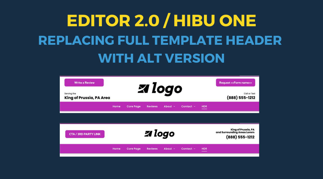
Follow these steps to replace the default template header with an alternate version
Show More →