Pixel vs. Percentage Units: Why They Matter in Responsive Web Design
When you're building websites that need to work across all screen sizes—from wide desktop monitors to narrow mobile phones—how you size elements matters.
At Hibu, we design for everyone. That means every element must display correctly on every device. If your content is misaligned, crammed, or floating awkwardly, users won’t stick around—and they won’t convert.
One of the most important layout choices you’ll make is whether to use
pixel or
percentage units for sizing.
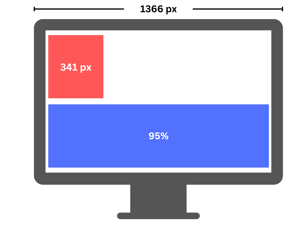
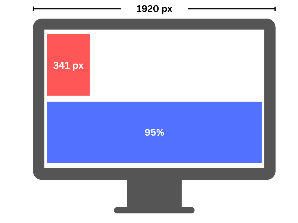
Pixel Units: Fixed and Inflexible
Pixels are absolute.
A container set to 341 pixels will always be 341 pixels—on a large monitor or a small phone. Fixed widths don’t scale, which often leads to broken layouts or horizontal scrolling on smaller screens. You get exact control, but at the cost of flexibility.
Percentage Units: Flexible and Responsive
Percentages are relative.
A container set to 95% width scales based on its parent container or browser window. This makes your layout fluid. It adapts automatically to screen size—without the need for extra media queries. Users get a better experience because the content flows naturally, looks balanced, and feels intuitive on any device.
What’s Changed with Editor 2.0
With the rollout of
Editor 2.0, we now have
greater flexibility to control spacing and layout per device—no coding required. Users don’t touch CSS. Instead, everything is managed visually through the
Design Panel in the Duda editor, allowing teams to:
- Adjust padding and margin values for desktop, tablet, and mobile
- Customize alignment and spacing for each screen size
- Control how elements stack or shift between devices
- Show or hide elements depending on the device
One important change to keep in mind:
One important change to keep in mind: what used to be called rows are now referred to as sections. By default, new sections are
not full-bleed. So when you're adding a new section, you’ll almost always want to switch it to full-bleed to match the rest of the site and keep everything consistent. If you forget, your section might look boxed in, misaligned, or narrower than it should.
All
designed sections will already be set up correctly as full-bleed. This only applies when
you add a new one manually.
Why This Matters
Spacing and sizing aren’t just visual preferences—they directly impact user experience and performance. Misaligned content, cramped sections, or layouts that don’t adapt to the device can make your site feel broken, especially on mobile. Visitors lose trust fast—and that means fewer conversions.
With Editor 2.0, we’ve equipped teams with intuitive tools to ensure every element looks and feels right on every screen. And thanks to percentage-based sizing, our layouts remain flexible and fluid—able to respond to whatever screen size they’re viewed on.
Here’s a simple rule of thumb:
Use
pixels when you want fixed, consistent sizing:
- Spacing (padding, margins)
- Font sizes
- Button sizes and tap targets
- Inside containers or cards
Use
percentages when you want things to scale with screen size:
- Container widths
- Column layouts
- Gaps between columns
- Full-width sections
Think of it like this:
- Pixels = control
- Percentages = flexibility
Use both to balance structure and responsiveness.
Bottom Line
Responsive design isn't just a feature—it’s a requirement. With the capabilities of Editor 2.0, our teams now have the power to make smart, device-specific layout decisions with ease. And by leaning into
percentage-based sizing when flexibility is needed, we ensure every website feels just right, no matter where it’s viewed.
At Hibu, we build with responsiveness in mind—because great design meets people where they are.