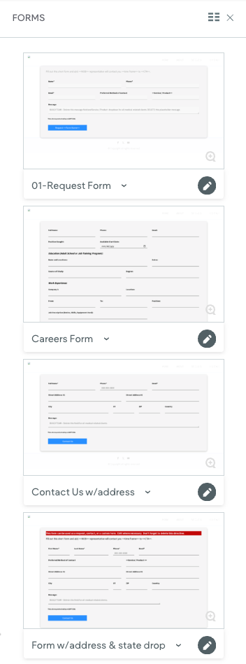
New Form Sections
September 24, 2024
We've added new forms to make your work easier, including enhanced contact forms and job application fields. Here's what you need to know:
New Form Types
- Enhanced request, contact, or custom form with additional fields like first name, last name, address, city, state (dropdown), and zip.
- Careers / Job Application Form with multiple education and previous employment fields.
Important Notes
- The careers form is a starting point. You may need to add more fields based on what the customer wants.
- Never include fields that ask for sensitive information like:
- Driver's license number
- Social Security number
- Medical information
- Financial information
- Label buttons to complete the sentence "I want to..." For example:
- "I want to (Get a Free Estimate)"
- "I want to (Apply Now)"
- This helps users understand exactly what action they're taking.
How to Update a Form on a Page
- Add a new row at the bottom of the page, just above the footer.
- Go to "Sections → Forms" and choose the new form you want to use.
- Copy the new form.
- Find the old form on the page and paste the new form in its place.
- Delete the old form.
Remember to update submission information (email, subject line, etc.) and make sure the reCAPTCHA is setup correctly.
This form can be used as a request, contact, or a custom form. Edit where necessary. Don't forget to delete this directive.
Fill out this short form and a(n) <<NOB>> representative will contact you <<time frame>> to <<CTA>>.
Contact Us

All icon-based copy block sections should maintain a balanced, consistent appearance. If the total number of blocks leaves an incomplete final row, adjust the layout so the section still looks intentional and visually even.

A 301 redirect: guiding web traffic to a new destination with a permanent, virtual "follow me" sign.

This Post has moved to The Hibu One Spec Site

This setup provides clients with a lightweight, SEO-optimized, scalable way to showcase inventory using the blog feature. It requires design discipline, metadata precision, and clear client education to function effectively. Restores client-side flexibility after the removal of manual page creation capabilities