Capturing Accurate Page Counts
February 27, 2025
Capturing Accurate Page Counts
Ensuring all production teams follow a consistent method for determining countable pages on a client’s website is crucial. This standardization helps accurately manage workloads and turnaround times. It's important to distinguish this "page count" from the client's allotted page count, as some pages, while not counted against the client's limit, still require time and expertise to create.
Steps to Accurately Determine Production Page Count:
1. Preliminary Review
- Collect the sitemap, questionnaire, or any documents outlining the website's intended structure.
- Identify both visible and hidden pages based on these documents.
2. Efficient Methods to Identify All Pages
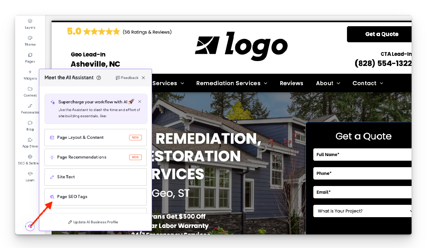
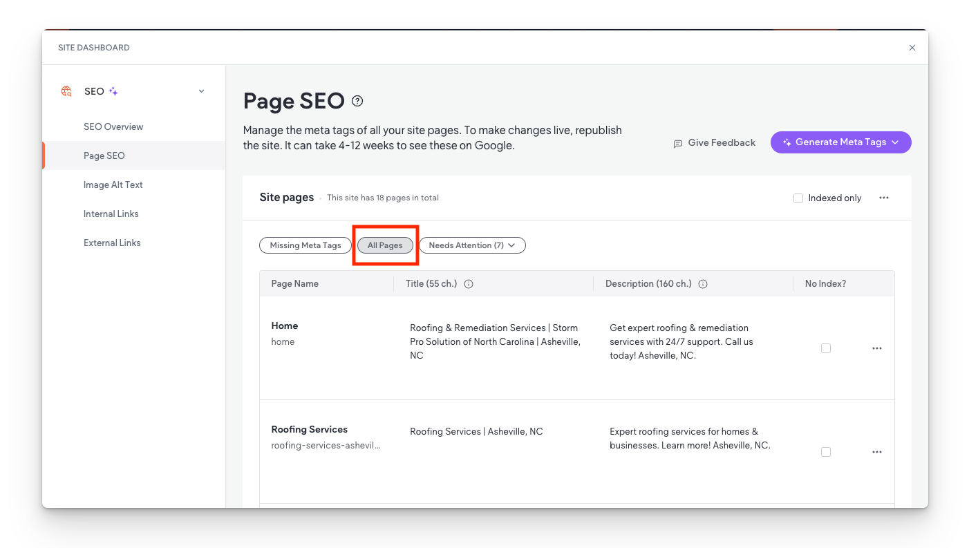
- Click the purple circle AI button located in the bottom left corner
- Select Page SEO Tags
- Select All Pages
- Manually count the pages listed.
- Note: Some template pages might appear, but this method reliably includes all necessary pages without significant omissions.|
3. Categorizing Pages
- Service Pages:
- Count all service-related pages (e.g., individual services, Home, About, Contact).
- Include any services mentioned in the questionnaire.
- FAQ and Blog Pages:
- Always count FAQ and Blog pages, regardless of their current visibility or creation status:
- If visible or created, categorize them as standard pages.
- If not yet visible or created, categorize them under Hidden Pages.
- Hidden Pages:
- Include pages intended for future use or those required but not yet visible or created.
- Exclude asset-only pages used solely for functionality (e.g., "First-Last," assistant banners, unused forms).
- Third-Party Link Pages in Navigation:
- Identify pages that link to external sites (e.g., financing pages directing users to external platforms).
- Exclude these from the count, as they don't require building.
By adhering to this standardized process, production teams can ensure consistency and efficiency
in website development projects.

All icon-based copy block sections should maintain a balanced, consistent appearance. If the total number of blocks leaves an incomplete final row, adjust the layout so the section still looks intentional and visually even.

A 301 redirect: guiding web traffic to a new destination with a permanent, virtual "follow me" sign.

This Post has moved to The Hibu One Spec Site

This setup provides clients with a lightweight, SEO-optimized, scalable way to showcase inventory using the blog feature. It requires design discipline, metadata precision, and clear client education to function effectively. Restores client-side flexibility after the removal of manual page creation capabilities