Designer QA Checklist Before Website Handoff
July 26, 2024
As a website designer - which includes copy writers offshore designers, DPS , ensuring that a website is polished and professional before handing it off to QA or a client is crucial. Here's a comprehensive checklist to help make sure all essential elements are in place and functioning correctly:
1. Text Span Should Not Exceed 900 Pixels
- A text span of 900 pixels or fewer keeps the message readable and gives a clean, organized look. Text that is too wide will give a bad overall impression because it is hard to read. The text span rule should be enforced on all pages except for the Reviews and other 3rd party widget pages.
Learn more.
2. Transparent Header and internal page Header Alignment
- It's essential to ensure that the transparent header and internal page header elements are properly aligned. This prevents any "jumping" of elements when navigating between the homepage and internal pages, providing a seamless and professional experience for users.
Learn more.
3. Site Colors Connected to a Theme
- All site colors should be linked to a site theme for easy updates. This not only ensures consistency across the website but also allows for efficient updates in the future. A well-connected color theme simplifies the process of maintaining a cohesive visual identity.
4. Reviews Star Color and Assistant Banner
- When applicable, update the reviews star color to match the color theme. This should also align with the assistant banner SMS code and phone number color for visual consistency.
Learn more.
5. Logo Clarity
- The logo should never be blurry. A blurry logo is often a sign that the logo is displayed larger than its actual size. Always ensure the logo is clear and crisp to maintain a professional look.
Learn more.
6. Logo Size Appropriately
- If possible, and if the logo file size permits, the logo should be enlarged to fill the available space in the header. This makes the logo more prominent and enhances brand visibility. Additionally, if the logo size and orientation permit, move the logo up into the header reviews or CTA row to help reduce the height of the header. See example .
7. Consistency with Logo Colors
- Ensure the site theme colors match the logo. The site colors should always align with the logo, even if the client provides similar hex colors during consultation. Using the exact logo colors ensures brand consistency and makes it easier to update the site theme if the client requests changes.
8. Contrast and Readability
- Ensure that all text elements are easy to read. This includes headlines, callouts, coupon copy, button text, video splash copy, recent reviews copy, header elements (such as call or text, geo, phone, and reviews summary), footer copy, and site copy. If necessary, bold elements and/or change colors to improve readability.
9. Icon Consistency
- Ensure all icons are consistent throughout the site. Avoid mixing line icons with filled icons to maintain a uniform look.
10. Custom Form Elements
- If a custom form is added, verify that the reCaptcha is included. Ensure all fields are correctly defined: the phone field is connected to the phone field type, the zip code to the number field type, the email to the email field type, etc. See examples.
11. Avoid Text-Based Brand Logos
- Avoid adding text-based brand logos if not provided by the client. Instead, search for the correct logo on Google. Only replace a text-based logo with an actual logo if you are 100% certain of its accuracy. See example.
12. Copy Block and Call-Out Content is Consistent with Button Text and Action
- Buttons guide users through a website and drive engagement. In copy blocks and call-outs, buttons should serve as clear invitations to take action. Ensure button text aligns with the call-out message and user expectations. For instance, if the copy block says "Order online and enter promo code MMMMMM for free delivery," the button text should be "Order Now" to ensure users are not confused and are more likely to take the desired action. Learn more.
By following this checklist, designers can ensure that their websites are polished, professional, and ready for handoff. A meticulous QA process reflects well on the designer's attention to detail and commitment to delivering a high-quality product.
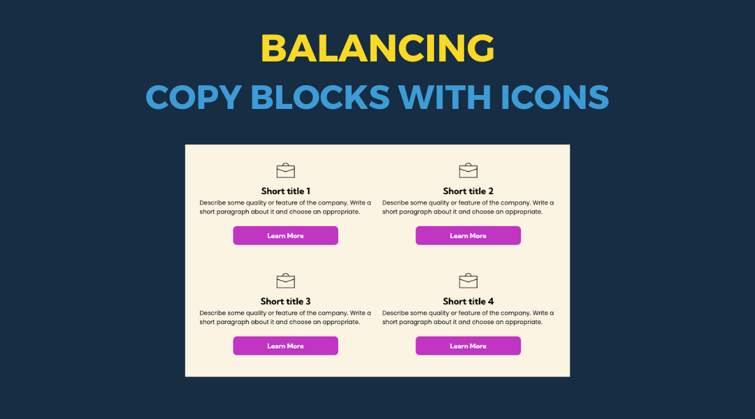
All icon-based copy block sections should maintain a balanced, consistent appearance. If the total number of blocks leaves an incomplete final row, adjust the layout so the section still looks intentional and visually even.
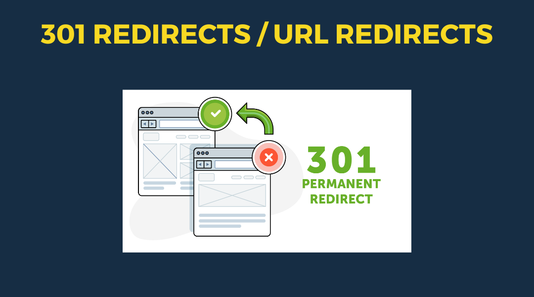
A 301 redirect: guiding web traffic to a new destination with a permanent, virtual "follow me" sign.
This Post has moved to The Hibu One Spec Site
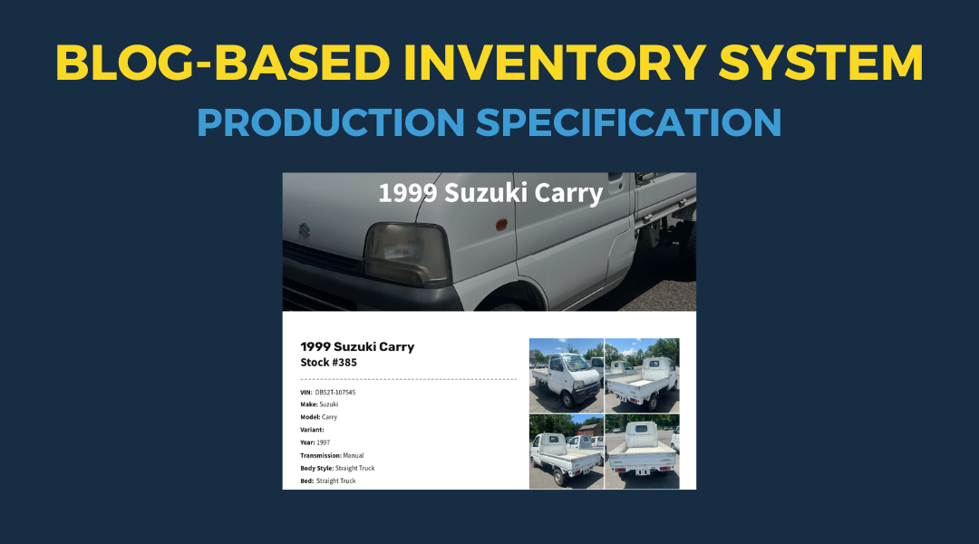
This setup provides clients with a lightweight, SEO-optimized, scalable way to showcase inventory using the blog feature. It requires design discipline, metadata precision, and clear client education to function effectively. Restores client-side flexibility after the removal of manual page creation capabilities