Button Callout / Copy Text

May 28, 2024

Why "Learn More" May Not Be Your Best Option

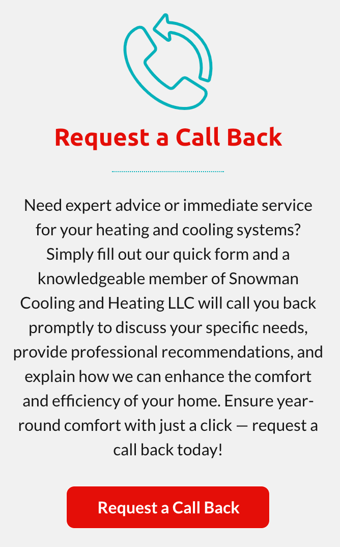
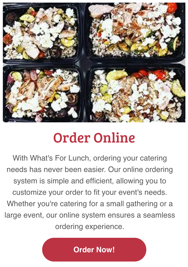
Buttons play a crucial role in guiding users through a website, serving as key touch points for interaction and engagement. In the context of callout or copy block buttons, their purpose extends beyond mere navigation—they act as invitations to explore, discover, and take action. The button text must therefore be carefully crafted to align with the surrounding content and the user's expectations.


“While "Learn More" is a common choice and often the most logical option when the copy block or call-out is specific to a product or service, it can sometimes fall short in providing the specific guidance and motivation needed to drive deeper engagement – especially for out or norm pages.” Here’s why "Learn More" may not always be the best option and what to consider instead:

  • Menu Information: "View Menu"
  • Contact Page: "Contact Us"
  • Event Registration: "Register Now"
  • Request a Free Estimate: "Request Now"
  • Product Features: "Explore Features"
  • Case Studies: "Read Case Study"
  • Testimonials: "Read Testimonials"
  • Career Opportunities: "View Job Openings"
  • Blog Posts: "Read Article(s)"
  • Special Offers: "View Offers/Specials/Discounts, etc"
  • Membership Information: "Join Now"
  • Course Enrollment: "Enroll Today"
  • Demo Request: "Request Demo"
  • Newsletter Signup: "Subscribe Now"
  • Downloadable Content: "Download Guide"
  • Project Gallery: "View Projects"
  • Virtual Tour: "Take a Tour"
  • FAQs: "Read FAQs"


These alternatives are merely suggestions that can provide clearer, more specific calls to action, aligning better with the user's intentions and the context of the surrounding content. Implementing these suggestions can enhance both usability and engagement.

By Hibu Sections April 9, 2025
In this section, you’ll learn how to control the size of elements using different types of units in Editor 2.0. We’ll break down how viewport width (vw) and height (vh) respond to the browser window, how the auto unit allows containers to resize based on their content, and how min/max values help you keep your elements within practical size limits. Together, these tools give you greater control over how your site adapts across devices—without relying on fixed pixel values.
April 9, 2025
Flexbox is the foundation for how columns behave in Editor 2.0. It controls how elements stack, align, and space themselves inside containers, giving you full control over layout across different screen sizes. By adjusting properties like stacking direction, content alignment, and wrap, you can create clean, organized designs that adapt smoothly to any device. These features help prevent layout issues, make better use of space, and simplify how you manage rows and individual elements. Learning how to use Flexbox effectively leads to faster builds and more consistent, responsive websites.
By Hibu Sections April 9, 2025
Understanding layout elements and the Layers Panel is key to building clean, responsive websites. Layout elements help you control structure—how widgets are grouped, how content stacks, and how different parts of the page respond across breakpoints. The Layers Panel gives you a clear view of that structure, making it easier to manage complex sections, find hidden elements, and keep your layout organized. Together, these tools let you build with more precision, troubleshoot faster, and maintain consistency across the entire site.
By Hibu Sections April 8, 2025
Breakpoints are specific screen widths where your website layout shifts to fit different devices, like phones, tablets, and desktops. They’re a key part of responsive design, allowing you to adjust styles so your site looks and works well on any screen. In the editor, you can see how styles behave at each breakpoint, apply universal styles, and override them when needed. You can also preview your site at different screen sizes to make sure everything looks right.
Show More →