Balancing Copy Blocks with Icons
October 24, 2025
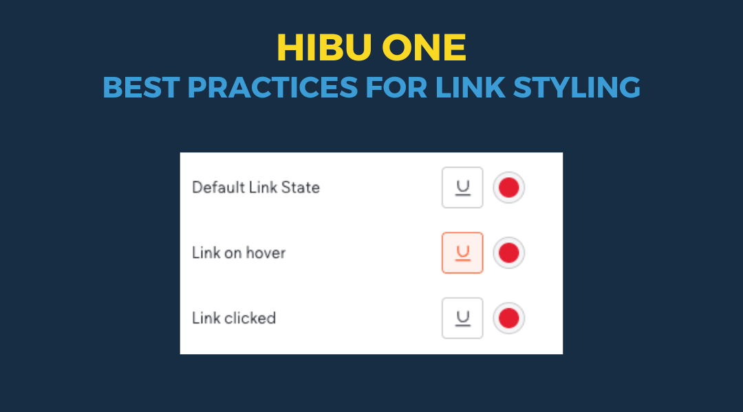
This Post has moved to The Hibu One Spec Site
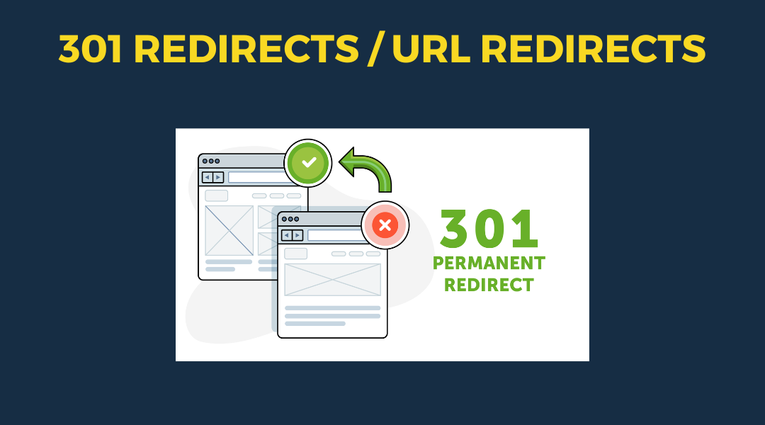
A 301 redirect: guiding web traffic to a new destination with a permanent, virtual "follow me" sign.
This Post has moved to The Hibu One Spec Site
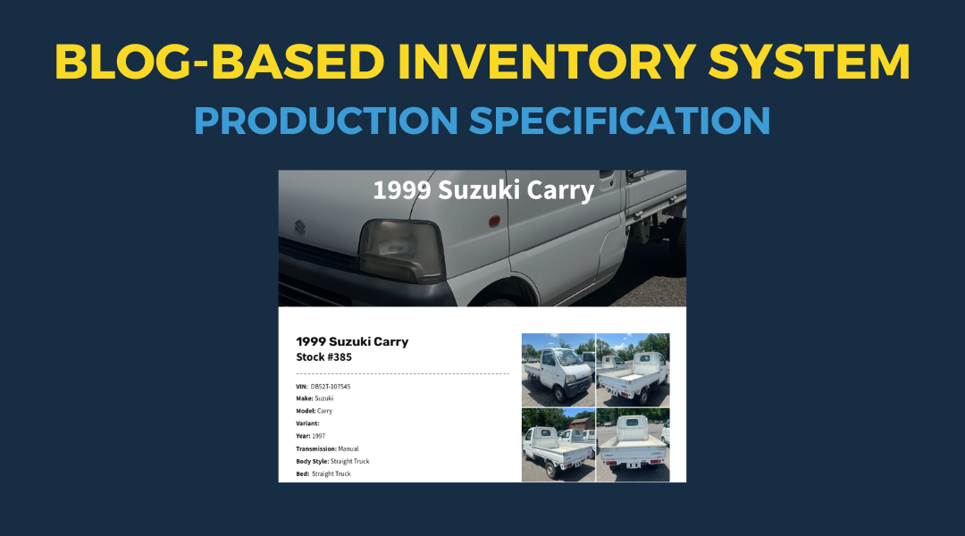
This setup provides clients with a lightweight, SEO-optimized, scalable way to showcase inventory using the blog feature. It requires design discipline, metadata precision, and clear client education to function effectively. Restores client-side flexibility after the removal of manual page creation capabilities
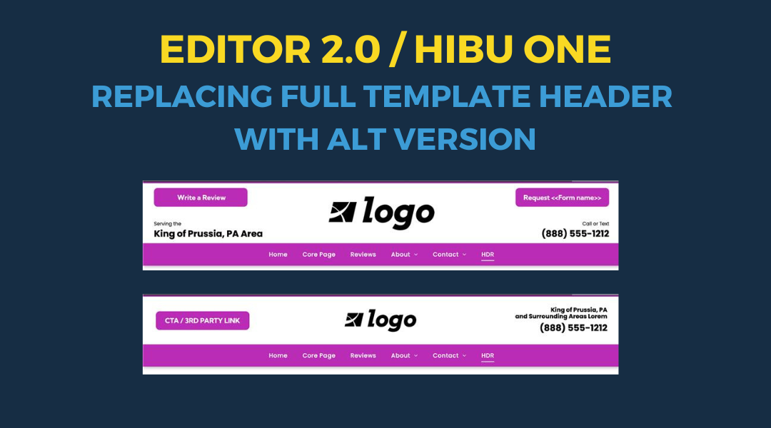
Follow these steps to replace the default template header with an alternate version