Tabs Widget
Tabs Widget
The Tabs widget serves as a valuable tool for organizing and presenting content efficiently on websites. With Tabs, visitors can seamlessly navigate between different sections of related content by clicking on designated tabs, streamlining the browsing experience without the need for extensive scrolling.
Tabs offer an elegant solution for showcasing various types of content such as Services, Plans, or Team members, presenting information in neatly organized sections while conserving space and maintaining a clean layout.
While the product preference leans towards displaying content through copy blocks or unique rows for improved accessibility and SEO, there may be specific scenarios where the Tabs widget proves beneficial.
In instances where clients insist on integrating a Tabs widget into their Hibu Site, a set of instructions, rules, guidelines, and considerations have been outlined to ensure its effective utilization.
Content Editor
To access the content editor:
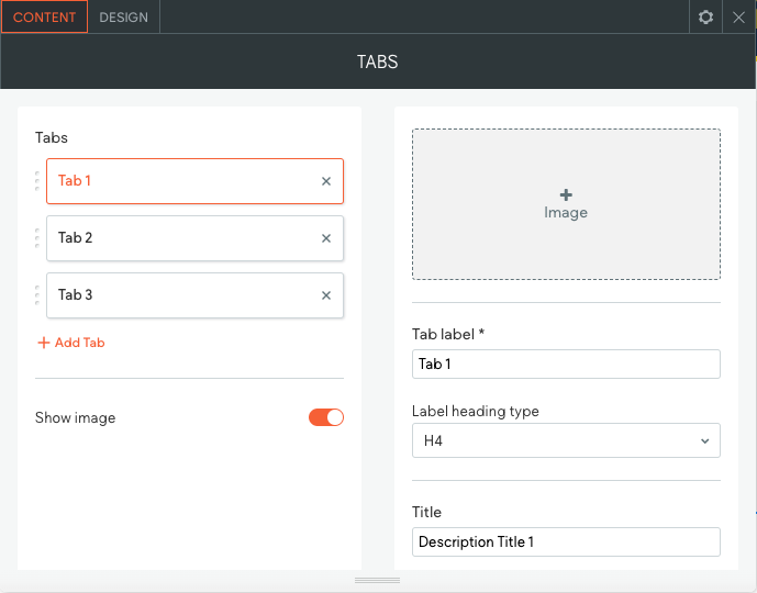
- Right-click the widget, and click Edit Content.
- To add a new tab, click Add Tab.
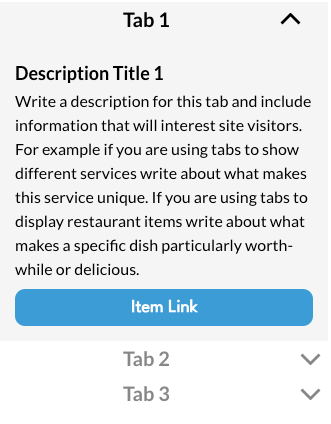
- To edit the image (and alt text), Tab label, Label heading type, Title, Description, and button, click the tab.
- Header tags are available to make your text more easily identifiable by search engines. It is recommended you select H4 for the Label Heading Type.
- To display images on the tabs, click the Show image toggle.
- When incorporating an image, designers may find it necessary to adjust the image's height, width, or crop to ensure proper alignment at the top.
- It's important to note that the height and width adjustments apply universally to each tab. Exercise discretion when making adjustments, as what works for one image may not necessarily work for another.
- Include an alt text field for each image.
Design Editor
To access the design editor:
- Right-click the widget, and click Edit Design.
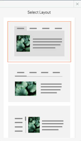
- Click the layout to select a different layout for the tabs.
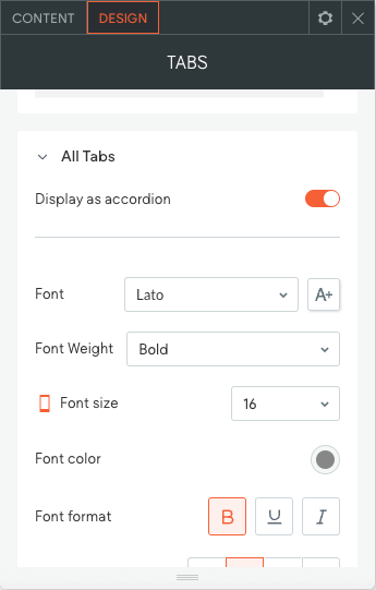
- Click All Tabs to customize the style of unselected tabs, reverse the tab direction, and control the tab layout on mobile.
- Click Selected Tab & Hover to customize the text style and background. This does not affect the All Tabs design.
- Click to change the Description Style, Button Style, and Image Style.
Notes:
- You can have as many tabs you want, but keep in mind that the space for each label is reduced with each new tab.
- Keep tab labels short. Two words maximum. Edit and abbreviate when necessary.
- Tab label and Tab Title do not have be the same.
- For desktop and tablet displays, there are four layout options available. All layouts except for the vertical/left gutter option are approved for use. If a designer opts for a different layout, remember to maintain consistency throughout the site if multiple tab widgets are used.
- There are two layout options: tabs and accordion. The tabs layout can be navigated by swiping.
Mobile View
There are two layout options for mobile display: tabs and accordion. With the tabs layout, users can control it by swiping. It's recommended that designers
ALWAYS opt to display as an accordion on mobile, allowing tabs to be shown vertically rather than horizontally.
To change the Tabs widget for mobile:
- In the top navigation bar, click the device view to switch the view to mobile.
- Right-click the widget, and click Edit Design.
- Click All Tabs, and then click the Display as Accordion toggle.