Sections → Icons / Logos
Sections → Icons / Logos
Many clients wish to display a row or grid of brand logos or accreditation / affiliation badges on their website. This guide will provide instructions and tips on how to integrate the hWP "icons-logos" section to achieve this.
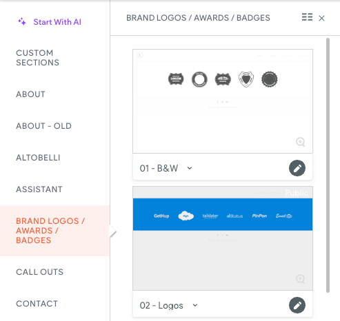
Begin by inserting the section into the preferred area on the page, usually positioned above the footer, following the usual procedure. You can find these sections conveniently located in the Sections→Brand Logos/Awards/Badges folder.
Designers have the flexibility to replace the PBN logo row with any of the six pre-designed sections available. Furthermore, they have the liberty to customize background colors as per their preference.
Rules and Guidelines
Following these rules and guidelines will make sure your images show up right and look the same on every page of your website.
Content Settings:
- Leave the title, description, and button fields blank and hidden.
- Apply appropriate Alt Text to each image.
Image Settings (apply to each image):
- Position should be set to middle/center.
Notes:
- Signing the Digital Content Release Agreement is not required for clients to incorporate their provided logos or retrieve logos from their current website.
- Should the client submit a low-quality brand logo, consider consulting our Resource Library for alternative options featuring higher quality.
- Logos may appear cropped/clipped within the widget but will display correctly on the webpage.
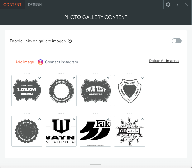
- Toggle the "Enable links on gallery images" option if you need to link images.
- Only activate the Zoom hover effect when there's a link attached.
- Avoid tightly cropped images to prevent clipping during the zoom hover effect.
- Maintain consistent sizing and cropping for images, leaving 15-20px of whitespace on all sides.
- When dealing with logos of varying sizes and dimensions (portrait, landscape, square), it's advisable to standardize their presentation for consistency. To achieve this, create a square white canvas and position each logo in the center. This method ensures that all logos are displayed uniformly across your website. Repeat this process for each logo to maintain a cohesive and professional appearance.
- If a client asks to add a logo but doesn't provide one, first, check our resource library. If it's not there, you can create and use a text-based logo. Just put it on a square white canvas and center it.