Divider Widget: Dots, Dashes, Curves and More
June 7, 2024
Divider Widget
The Divider widget’s layout library has been reramped and it now includes 6 new and sleek design styles for you to choose from. Here they are:
Hibu designers are free to use the newly revamped Divider Widget -- even when the selected template design doesn't feature lines. Adding a divider can enhance a website's layout and readability when used appropriately. Here are some key points to consider:
When to Use a Divider
- Separating Sections: Use dividers to clearly distinguish between different sections of content, such as separating the header from the body or different topics within the body.
- Grouping Related Content: Dividers can help group related information together, making it easier for users to navigate and understand the content.
- Enhancing Visual Hierarchy: Dividers can be used to create a visual hierarchy, guiding the user's eye to the most important information first.
- Improving Readability: Adding a divider can break up dense text, making it more readable and less overwhelming for the user.
Dos and Don'ts
Dos:
- Keep It Subtle: Use thin lines and soft colors that complement the overall design without drawing too much attention.
- Consistent Style: Ensure the style of the divider matches the overall design theme of the website.
- Use Sparingly: Only use dividers where necessary to avoid cluttering the design.
- Responsive Design: Make sure dividers are responsive and look good on all screen sizes, including mobile devices.
Don'ts:
- Overuse: Avoid using too many dividers, as this can make the design look fragmented and disjointed.
- Bold and Overbearing Lines: Steer clear of thick or overly bold lines that dominate the design.
- Inconsistent Styles: Mixing different styles of dividers can make the design look unprofessional and chaotic.
- Ignoring Accessibility:
Ensure that dividers are accessible and do not hinder the readability or usability of the content for all users, including those with visual impairments.
By following these guidelines, designers can effectively use the Divider Widget to enhance their website designs, even in templates that do not originally feature lines.
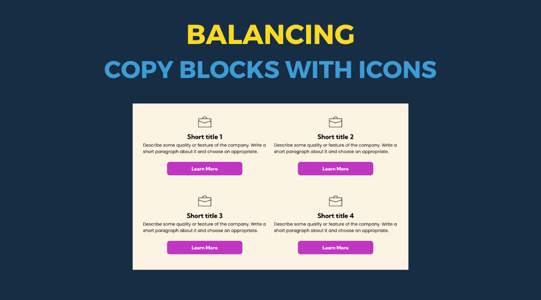
All icon-based copy block sections should maintain a balanced, consistent appearance. If the total number of blocks leaves an incomplete final row, adjust the layout so the section still looks intentional and visually even.
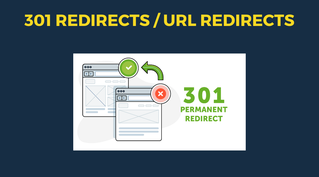
A 301 redirect: guiding web traffic to a new destination with a permanent, virtual "follow me" sign.
This Post has moved to The Hibu One Spec Site

This setup provides clients with a lightweight, SEO-optimized, scalable way to showcase inventory using the blog feature. It requires design discipline, metadata precision, and clear client education to function effectively. Restores client-side flexibility after the removal of manual page creation capabilities