Before / After Widget
May 16, 2024
Overview
The Before/After image widget allows you to present two images in a dynamic and interactive manner, using a customizable slider to seamlessly transition between the two. This can create a compelling visual comparison that engages users.
Why You Might Not Want to Use the Before/After Image Widget:
- Mismatch in Image Quality or Angles:
- If the "Before" and "After" pictures were not taken from the same angle, or if there's a significant difference in lighting, quality, or resolution between the two images, the slider effect might emphasize these inconsistencies rather than the intended changes.
- Text Labels in Images:
- If the images already have "Before" and "After" labels or other text overlays, using a slider can create visual clutter and make it difficult for users to focus on the actual differences.
If the images are well-matched and free of text, the designer is free to use the widget to create an engaging visual comparison.
Steps to Add Before / After Widget
- To add the widget:
- In the left panel, click Widgets.
- Click and drag the Before & After widget into your site.
- Content Editor
- Right-click the widget, and click Edit Content.
- Click + Image to add the before and after images.
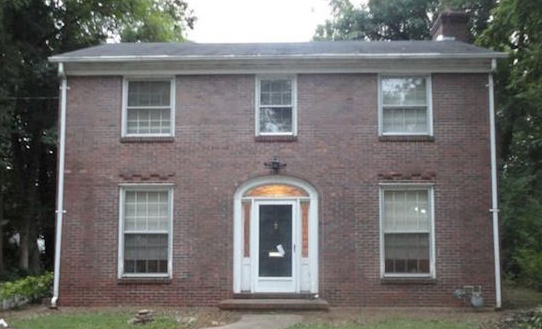
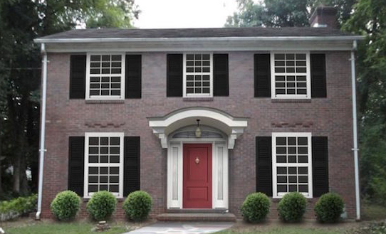
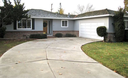
- When organizing multiple sets of before and after images, use the following naming convention: name the images in the first set as before-01 and after-01. For the second set, use before-02 and after-02. Continue this pattern for all subsequent sets to maintain consistency.
- Note:
This naming convention is specifically for before and after images only and may not follow the general image file naming best practices.
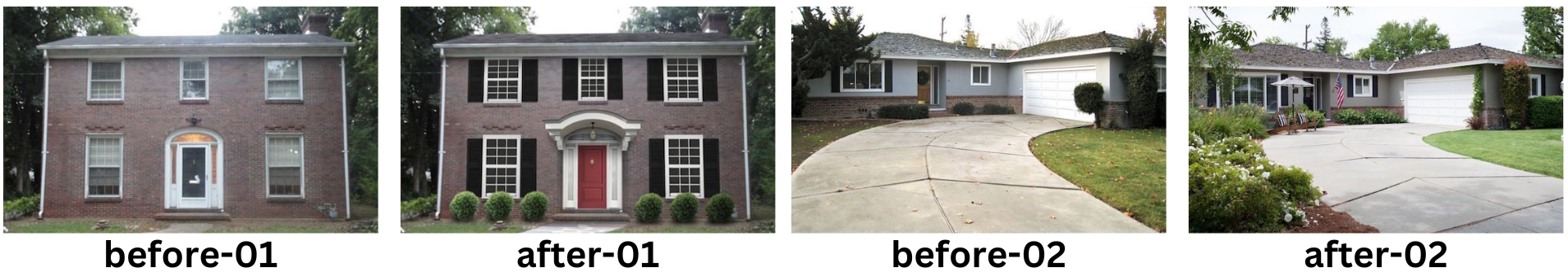
- Before images are always on left; After images are displayed on right.
- Type labels for the images. To hide the labels, toggle the orange eye icon on.
- Type or generate AI alt text for the images
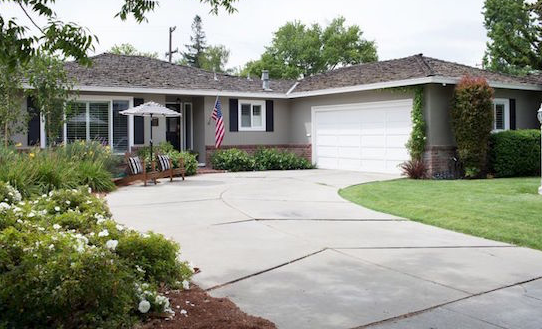
- For before and after images, you can use the same alt text but add "before" or "after" to distinguish between them. For example:
- residential roof replacement - before
- residential roof replacement - after
- Design Editor
- Right-click the widget, and click Edit Design.
- To customize the images and slider, click Images & Slider.
- Displayed image should never exceed actual width
- The displayed before and after image should be the same size regardless if one image is larger than the other.
- To customize the label style and text, click Labels
- Use the default Before and After labels unless instructed otherwise

All icon-based copy block sections should maintain a balanced, consistent appearance. If the total number of blocks leaves an incomplete final row, adjust the layout so the section still looks intentional and visually even.

A 301 redirect: guiding web traffic to a new destination with a permanent, virtual "follow me" sign.

This Post has moved to The Hibu One Spec Site

This setup provides clients with a lightweight, SEO-optimized, scalable way to showcase inventory using the blog feature. It requires design discipline, metadata precision, and clear client education to function effectively. Restores client-side flexibility after the removal of manual page creation capabilities