Blog Bio Page Build Instructions
June 28, 2024
Blog Bio Page Build Instructions
- If Bio page already exists, use that and supplement or update content if necessary (ie - if length is short)
- If no Bio page exists, follow the steps below:
- Click on the Pages icon on the left hand side of the platform
- Click on arrow next to "About" to expand the menu items below
- Click on the gear icon next to "First Last" (this is the Bio page template) and select "Rename"
- Rename: Enter the owner's first and last name, along with any relevant titles or prefixes, using the title case format of site (ie - if other pages are all caps in nav, make owner's name all caps)
- Example - Dr. Regina Phalange, MD
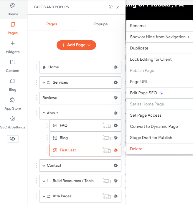
- Click on the gear icon next to the Bio page and select "Stage Draft for Publish"
- Click on the gear icon next to the Bio page and select "Edit Page SEO"
- Page URL: /first-last
- Update to owner's first and last name, using the title case format of site (ie - if other pages are all caps in nav, make owner's name all caps)
Ex - /regina-phalange - Page meta title: Prefix First Last, Title | NOB
- Update to owners name, using any appropriate prefixes and titles, then update NOB to the name of the business using the title case format of site (ie - if other pages are all caps in nav, make owner's name all caps)
Ex - Dr. Regina Phalange, MD | Haverford Medical Clinic - Page meta description: NOB [verb] offers / provides / serves / specializes in, etc. [Core business keyword (or phrase)] [City, ST or serving area]. Motivating factor. Motivating factor (space permitting). Motivating factor (space permitting).
- Update NOB to the name of the business and include details regarding the products and services offered by the business
Ex - Dr. Rufus T. Firefly, DDS has been specializing in family dentistry in the Boston area since 1994. Voted Top Doc by Boston Magazine 10 years in a row. - Click the 'x' to navigate to the Bio Page
- Click on the Bio Page Template to open the page
- Header: First Last
- Click on "First Last" and replace it with the owner's first and last name and any relevant prefixes or titles
- Header: NOB
- Click on "NOB" and replace NOB with the name of the business, using appropriate capitalization
- H3: First Last
- Click on "First Last" and replace it with the owner's first and last name and any relevant prefixes or titles
- Additional Sections: Update the remaining H3s and paragraph content to information applicable to that particular business
- Right Gutter
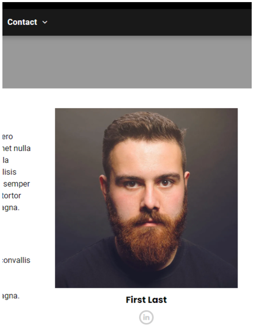
- If no LinkedIn, do not populate right gutter (ie, no photo, linkedIn icon), just delete the data from the template
- Photo: Update photo
- Right click on the image and select "Edit Content"
- Content: Scroll down until you see "Replace" and click on it
- Select the appropriate image or logo, or click "Upload" to upload one
- Use the picture provided by the owner, the LinkedIn profile picture, or the Logo
- Update alt text to person's name or let AI generate (click purple stars)
- If you let AI generate, adjust if necessary
- Design: Whatever the width of the picture uploaded is, adjust width to that here
- Scroll down until you see "Width"
- Manually enter the appropriate width into the box
Ex - if the size of the picture is 200x200, manually adjust width to 200px - First Last:
Update to the owner's first and last name, with any appropriate prefixes or titles
Ex: Joe Howe, Managing Partner - LinkedIn icon:
- Click on the icon and scroll down until you see the LinkedIn URL
- Update to client's LinkedIn profile page
Update Blog Template to Include Author:
- Click on the Blog icon on the left hand side of the platform
- Click on "Edit Layout" from the menu on the left
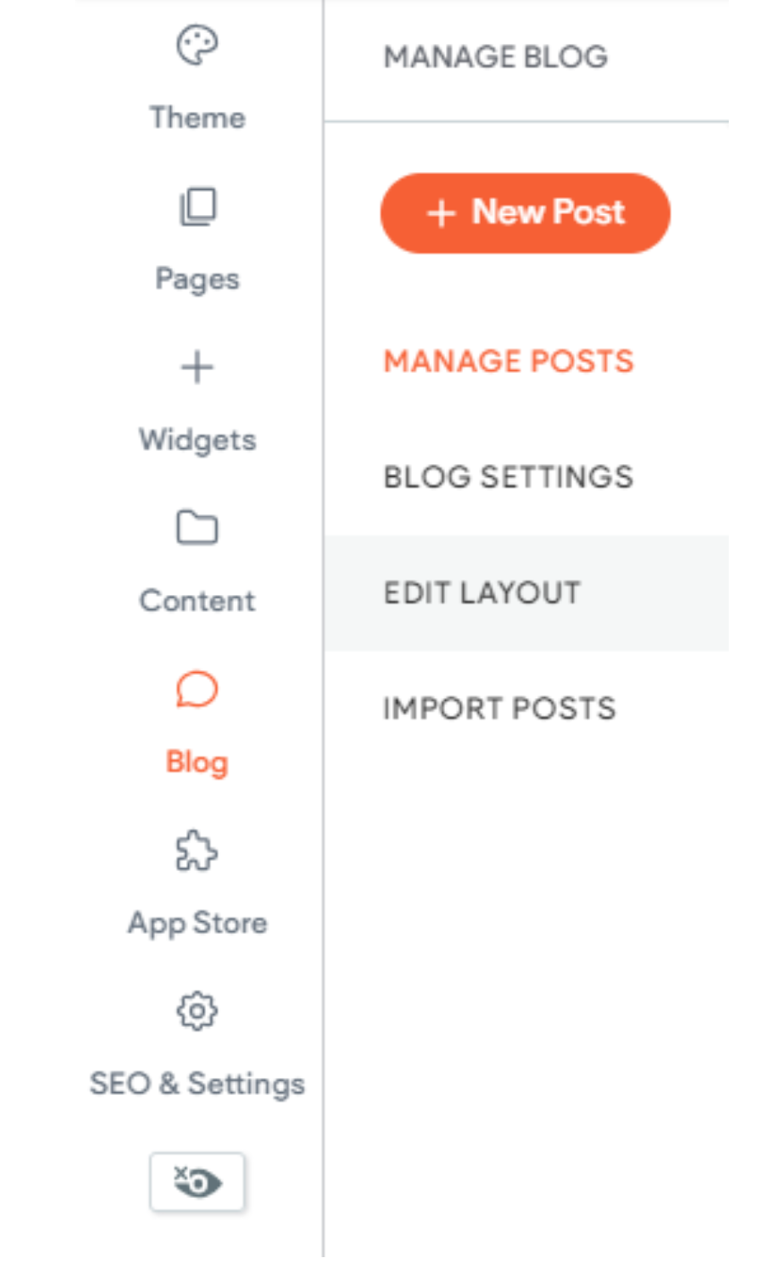
- On the left hand side, click on the eye to make the Author layout visible

- You should now see text display on the blog layout that says:
By First Last
POST PUBLISH DATE
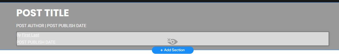
- Click on By First Last and select "Make Visible"
- Update First Last to the owner's name, using any applicable prefixes or titles and using the title case format of site (ie - if other pages are all caps in nav, make owner's name all caps)
Ex - Dr. Regina Phalange, MD - Select the updated name and then click the link icon in the formatting menu
- In the pop up box, select the "Existing site page" radio button, and then select the Bio page from the list of pages
- Hover over the POST AUTHOR | POST PUBLISH DATE text in the template and click on the 'x' to delete it
- Click "Done" in the upper right

All icon-based copy block sections should maintain a balanced, consistent appearance. If the total number of blocks leaves an incomplete final row, adjust the layout so the section still looks intentional and visually even.

A 301 redirect: guiding web traffic to a new destination with a permanent, virtual "follow me" sign.

This Post has moved to The Hibu One Spec Site

This setup provides clients with a lightweight, SEO-optimized, scalable way to showcase inventory using the blog feature. It requires design discipline, metadata precision, and clear client education to function effectively. Restores client-side flexibility after the removal of manual page creation capabilities