Too Much White Space
April 29, 2024
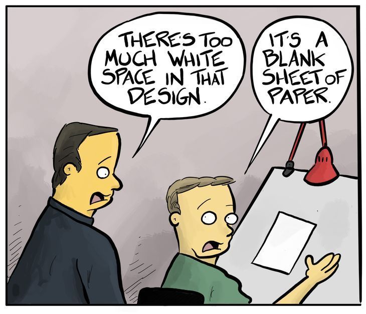
When Too Much White Space is Too Much
White space, often referred to as negative space, plays a crucial role in website design for several reasons. It's not just empty, unused space; it's a powerful element that helps to create a more refined and professional look. Here's why white space is beneficial:
- Clarity and Readability: White space makes content more legible by reducing visual clutter. This helps users to focus on the text, making it easier to read and understand. Think of it as giving your content room to breathe, which in turn makes the visitor's experience more pleasant.
- Attention and Focus:
By strategically using white space around important elements such as call-to-action buttons or key messages, you can guide the viewer's attention to those areas. This selective use of space can significantly improve the effectiveness of your website's communication.
- Overall Aesthetic: A clean and uncluttered layout conveys a sense of professionalism and elegance. Websites that effectively utilize white space often appear more thoughtful and deliberate in their design, which reflects positively on the brand's image.
However, like all good things, too much white space can have its drawbacks. Overuse of white space might:
- Create a Disconnect: Excessive space between elements can disrupt the flow of information, making it harder for users to navigate the site or understand how elements relate to each other.
- Appear Unfinished: An overly sparse design might give the impression that the website is incomplete or lacking in content, which can undermine the trust and confidence of visitors.
- Reduce Engagement: If users have to scroll excessively or can't easily find what they're looking for due to the vastness of the layout, they may become frustrated and leave the site.
The key is finding a balance. Effective web design uses white space to enhance usability and aesthetics without compromising the site's functionality or the user's experience. A seasoned designer knows how to strike this balance, creating spaces that are both beautiful and functional.


All icon-based copy block sections should maintain a balanced, consistent appearance. If the total number of blocks leaves an incomplete final row, adjust the layout so the section still looks intentional and visually even.

A 301 redirect: guiding web traffic to a new destination with a permanent, virtual "follow me" sign.

Overview

This setup provides clients with a lightweight, SEO-optimized, scalable way to showcase inventory using the blog feature. It requires design discipline, metadata precision, and clear client education to function effectively. Restores client-side flexibility after the removal of manual page creation capabilities