Background Overlay
April 29, 2024
Background Overlay
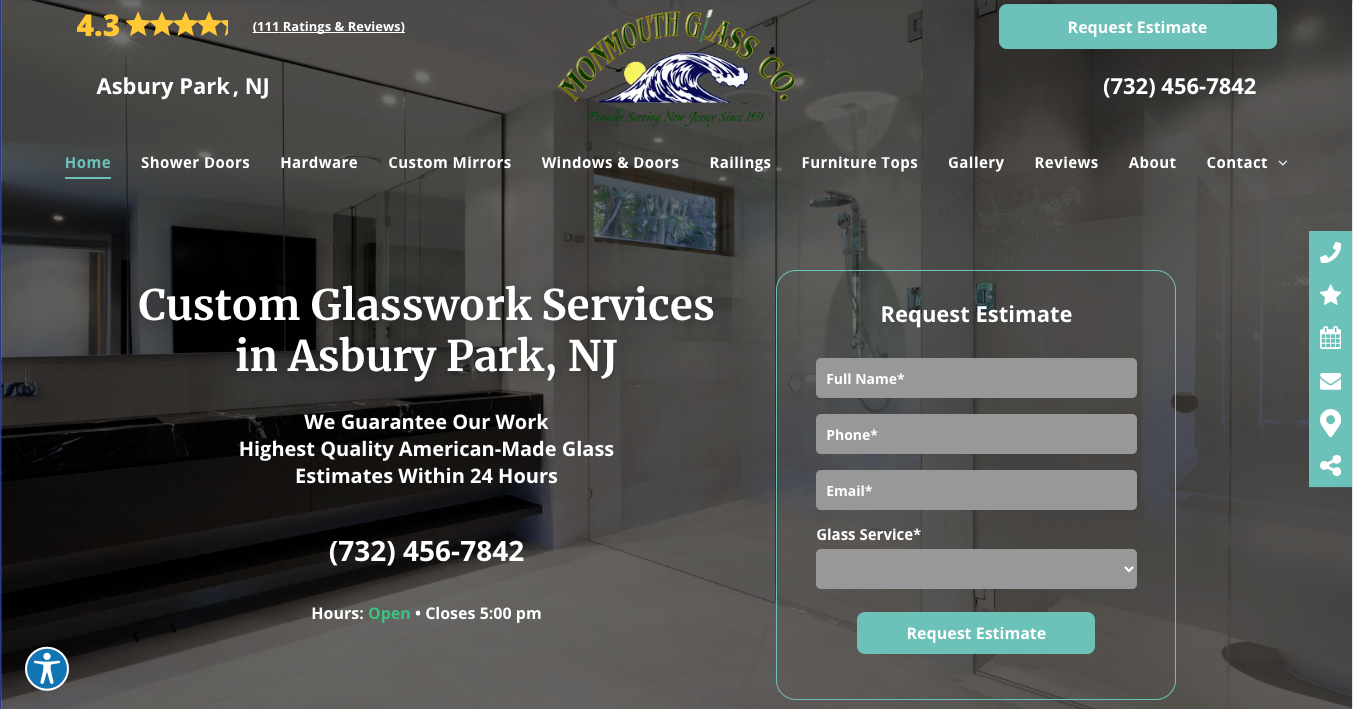
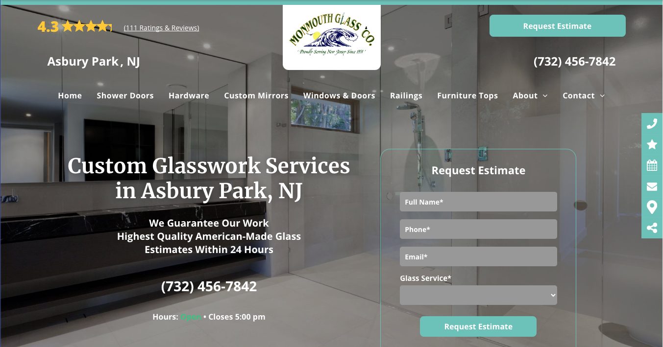
Background overlays are employed to improve text readability on top of background images, ensuring that the message is clear and legible. However, an overlay might be too dark if it adversely affects the user interface or the overall design. Consider the following when evaluating the darkness of an overlay:
- Text Legibility: If the text is difficult to read against the overlay, suggesting that contrast is insufficient, then the overlay may be too dark.
- Design Balance: An effective overlay complements the content; it should not be so dominant that it becomes the main focus unless intentionally designed that way.
- Visibility of Background:
The overlay should be light enough that the background image is discernible. If the image details are lost, the overlay is too dark, defeating the purpose of using an image instead of a solid color background.
An overlay should strike the right balance, providing sufficient contrast for legibility while still allowing the background image to support the design narrative. If the overlay obscures the image to the point where its presence becomes irrelevant, adjusting the darkness or considering a different design approach might be necessary.


All icon-based copy block sections should maintain a balanced, consistent appearance. If the total number of blocks leaves an incomplete final row, adjust the layout so the section still looks intentional and visually even.

A 301 redirect: guiding web traffic to a new destination with a permanent, virtual "follow me" sign.

This Post has moved to The Hibu One Spec Site

This setup provides clients with a lightweight, SEO-optimized, scalable way to showcase inventory using the blog feature. It requires design discipline, metadata precision, and clear client education to function effectively. Restores client-side flexibility after the removal of manual page creation capabilities