How to Use the Contrast Checker

March 21, 2025
  • Slide title

    Write your caption here
    Button
  • Slide title

    Write your caption here
    Button
  • Slide title

    Write your caption here
    Button
  • Slide title

    Write your caption here
    Button
  • Slide title

    Write your caption here
    Button
  • Slide title

    Write your caption here
    Button

Hibu Policy

All text on a Hibu One Smart Site must maintain clear, readable contrast across devices and screen types. Designers must follow WCAG contrast principles and the platform’s built-in contrast indicator. While WCAG AA standards remain the target, Hibu allows a controlled exception zone for cases where strict AA compliance results in a poorer visual outcome. Under no circumstance may text fall below the minimum contrast threshold defined in this rule.

Purpose / Why It Matters

Strong contrast ensures users can read text easily across screens, lighting environments, and accessibility needs. This rule maintains visual consistency while allowing designers controlled flexibility within safe limits.

Rules & Guidelines

1. Standard Requirement (Green Target)

Designers should choose color combinations that display a green indicator whenever possible.

  • Green = fully acceptable and preferred.

2. Exception Zone (Red Allowed With Limits)

Designers may use a color combination that shows a red indicator only when the contrast ratio is: 3.5 or higher

Designers may proceed within this range 
if:

  • The “green” option produces a noticeably worse design result
  • The chosen color is still clearly readable
  • The color aligns with the site’s theme and visual hierarchy
  • Minor adjustments (lightening or darkening either color) should be attempted before relying on the exception.

3. Hard Stop — Not Allowed

Text with a contrast ratio below 3.4 may not be used under any circumstance.

  • Below 3.4 = unreadable / fails immediately (no exception)
  • No exceptions. No overrides.

Final Thought

At Hibu, readability is non-negotiable. If visitors can’t clearly read the text, they won’t engage, won’t trust the content, and won’t convert. The contrast checker exists to protect the user experience—but good judgment still matters. When a color choice falls within the safe exception range (3.5–4.49), designers may choose the option that genuinely improves clarity and layout.

By Paul Altobelli October 24, 2025
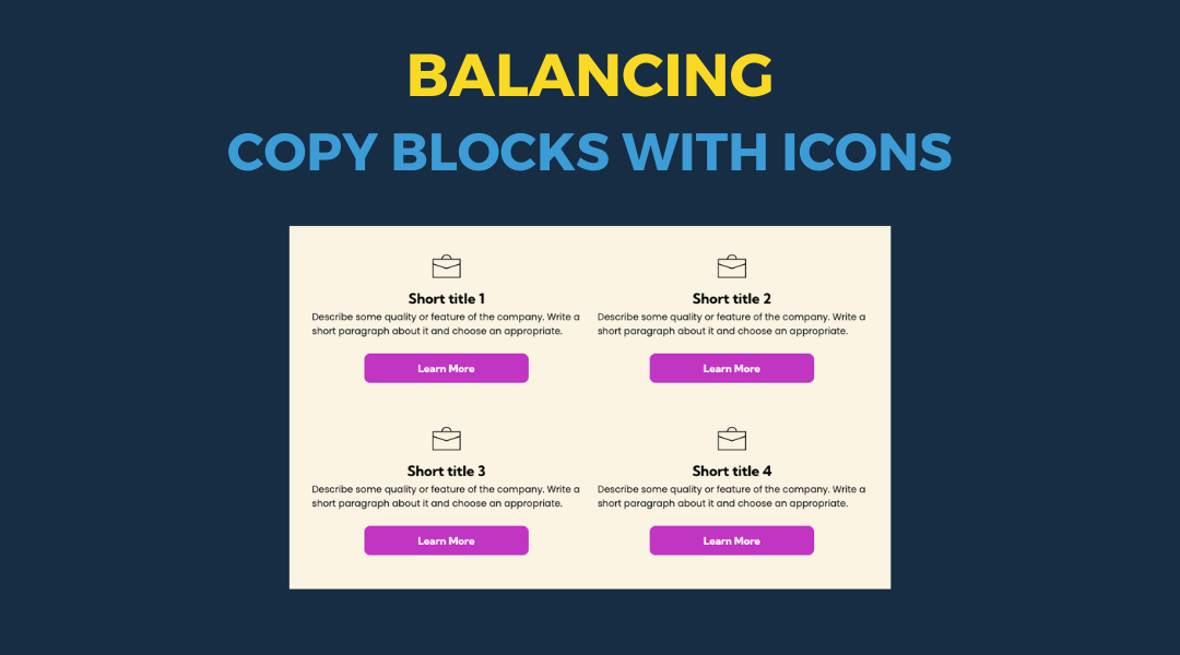
All icon-based copy block sections should maintain a balanced, consistent appearance. If the total number of blocks leaves an incomplete final row, adjust the layout so the section still looks intentional and visually even.
By Paul Altobelli September 26, 2025
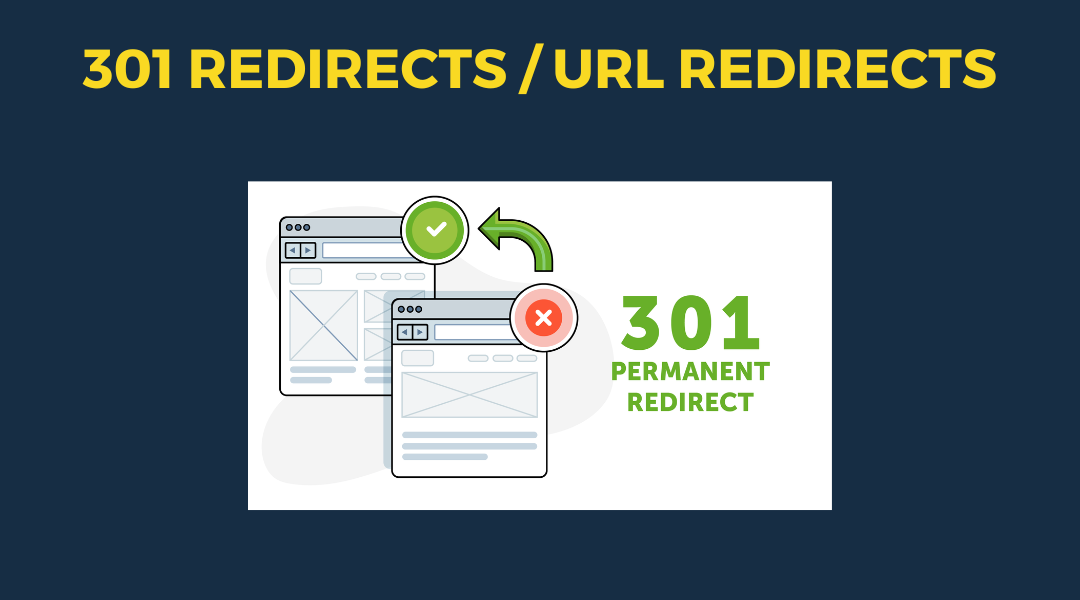
A 301 redirect: guiding web traffic to a new destination with a permanent, virtual "follow me" sign.
By Paul Altobelli July 15, 2025
Overview
By Paul Altobelli July 1, 2025
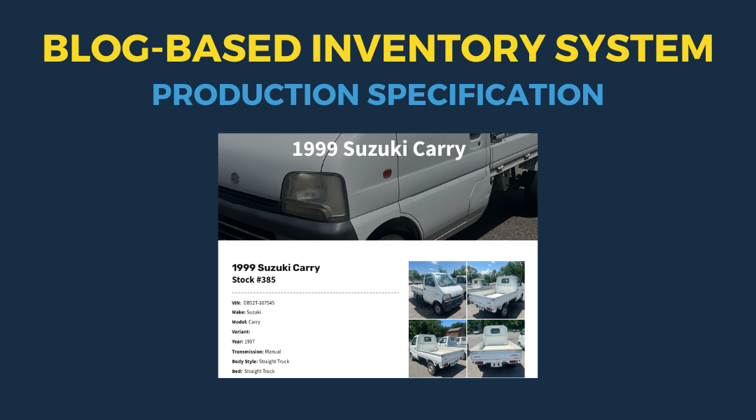
This setup provides clients with a lightweight, SEO-optimized, scalable way to showcase inventory using the blog feature. It requires design discipline, metadata precision, and clear client education to function effectively. Restores client-side flexibility after the removal of manual page creation capabilities
Show More →